How to Choose Abstract Art for Your Home (Even If You're Not Sure What You Like)
How to Choose Abstract Art for Your Home (Even If You're Not Sure What You Like)
There's a version of decorating that goes like this: you find a couch, you find a rug that complements the couch, and then you find a piece of art that matches both. It's safe. It's coordinated. It's also, more often than not, completely forgettable.
Here's the thing nobody tells you when you're shopping for art: your art doesn't need to match your room. It needs to give your room nerve.
A room can be styled perfectly and still say almost nothing about the person living in it. The art is usually where that changes — or where it doesn't. So before you go looking for something that "goes with" your space, it's worth asking a different question entirely: what do I want this room to say about me?
The Problem with "Matchy-Matchy" Art
You know the print. Maybe it's from Target, maybe it's from HomeGoods, maybe it's a word-art sign about the beach (more on that later). It's not a bad print, exactly. It's just that hundreds of thousands of other living rooms have the exact same one, chosen for the exact same reason: it matched the couch.
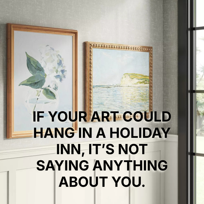
There's nothing wrong with wanting your home to feel put-together. But if the art on your walls could just as easily be hanging in a hotel lobby, it isn't doing the one thing art is uniquely suited to do — say something specific about you.
Choose by Emotion, Not Decor
So if not color-matching, then what?
Start with mood. Not "what colors are in this room" but "what do I want this room to feel like." Does it spark a memory, even a vague one you can't quite name? Does it make you feel something the second you walk in — calm, alive, curious, a little unsettled in a good way?
This is where a lot of people get tripped up, because they assume the art has to match the room's personality, too. It doesn't. In fact, some of the most interesting rooms are the ones where it doesn't.
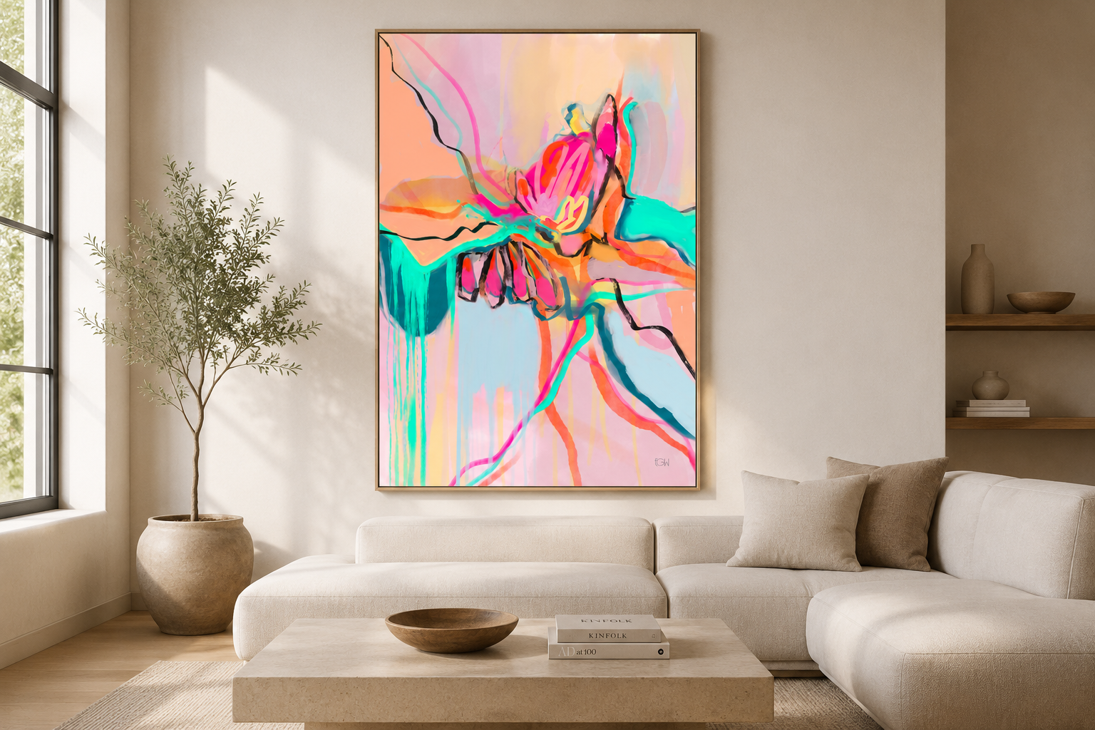
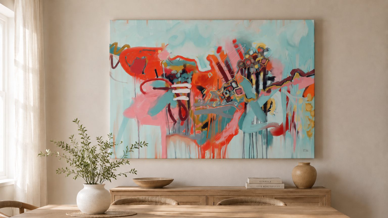
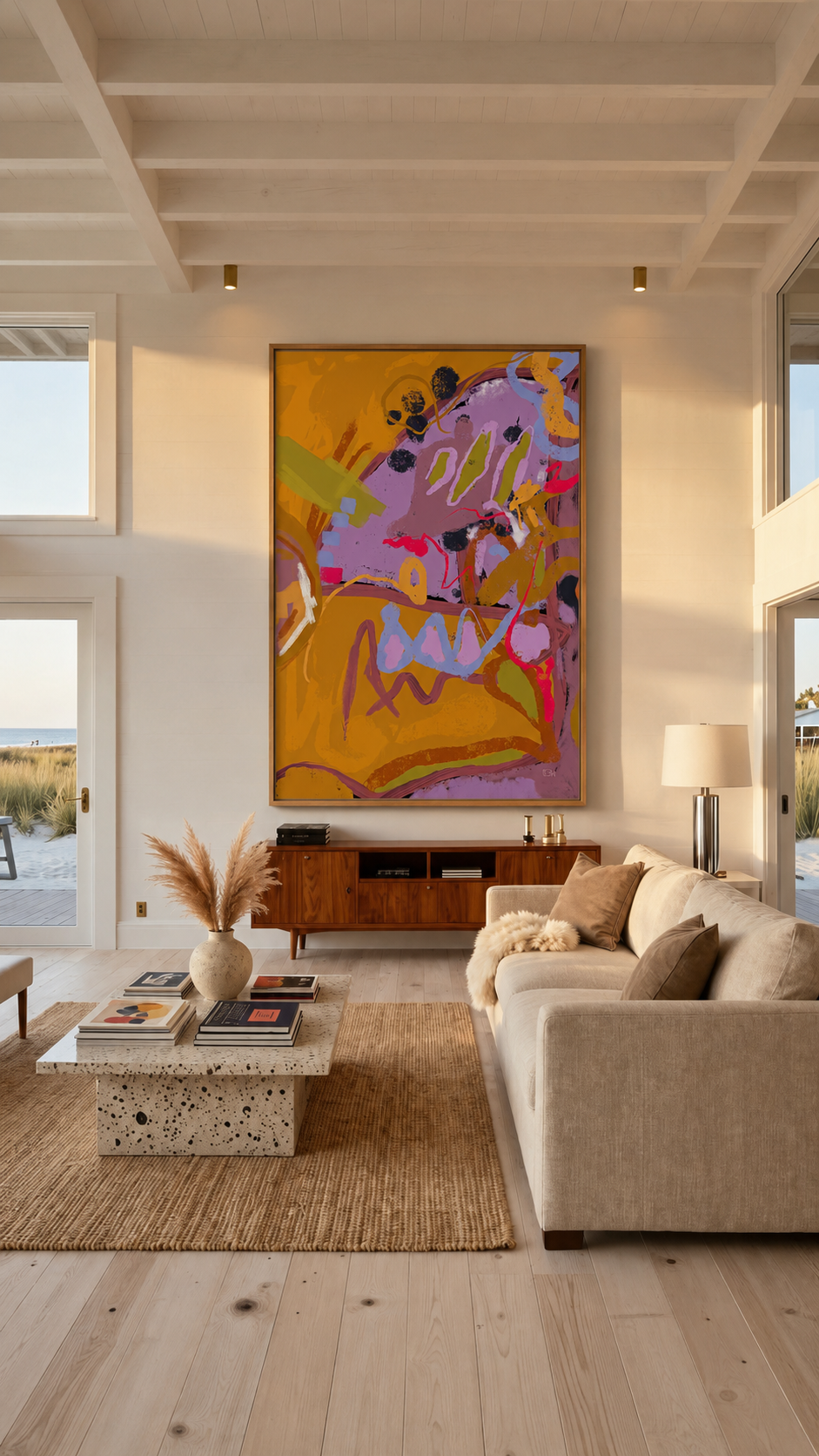
Picture a fairly neutral room — soft whites, natural wood, quiet textures. That palette might reflect someone's calm, reflective side. Now put a bold, colorful, high-movement piece of art on the wall. Suddenly the room isn't just calm anymore — it's calm and a little unexpected, which is probably closer to the truth of most people anyway. Nobody is only one mood. The room can hold both if you let it.
Art Can Speak to You Before You Know Why
I want to tell you about my partner, because she is, frankly, the perfect cautionary tale for this entire article — and also its best argument.
My partner loves word art. Specifically, beachy word art. "Salty Air, Sandy Hair" energy, but make it a wall sign. It is, at this point, a running joke.
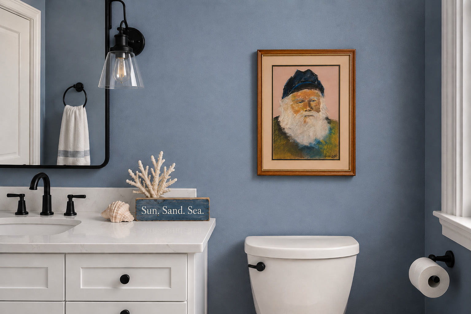
So you can imagine my surprise when she was utterly captivated by an original portrait of a boat captain, with a weathered face, big white beard, painted against a soft pink background. It had nothing in common with anything she'd ever hung on a wall before. No sand or boats. No sayings. Just this strange, striking old man staring out from a pink background that had no business working as well as it did.
She wasn't sure about it. Part of her thought it might be too weird, too far from "her style." But she also couldn't stop thinking about it.
I told her: that's exactly the feeling you buy art for. Not the "oh, that's nice" feeling. The one where you can't explain it and can't let it go.
She bought it. She still loves it. To this day, I don't think she could tell you why.
There is no flaw in this process. That's the process working exactly as it should. The best art doesn't always make sense next to the rest of what you own. Sometimes it's speaking to a part of you that the rest of your house hasn't caught up to yet.
Don't Look for Pretty. Look for Tension
Here's a piece of advice that sounds counterintuitive until you sit with it: stop looking for pretty.
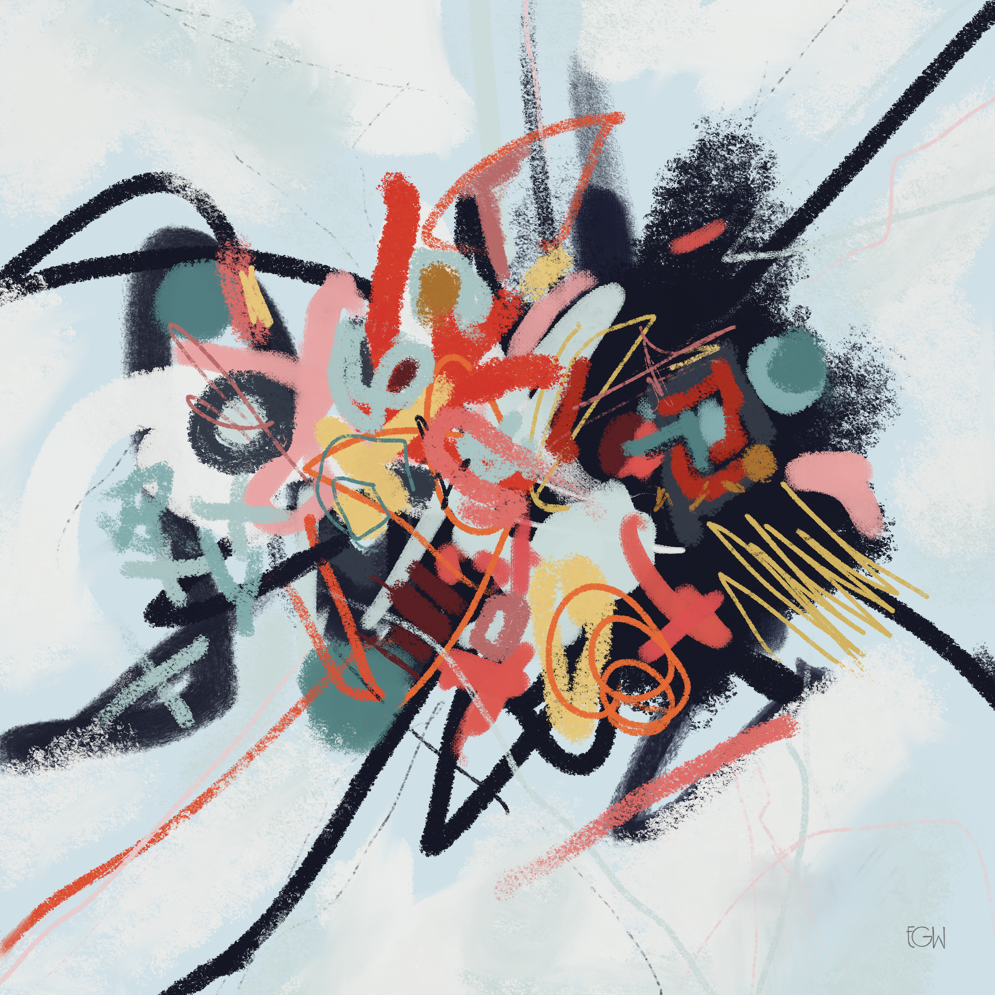
Pretty is easy. Pretty is pleasant and safe and forgotten within the week. What you actually want is tension — a piece with an unusual composition, strong contrast in values, something a little unresolved. Abstract art, done well, doesn't tell you exactly what it's about. It leaves room for you to decide, and that gap is exactly where the interest lives.
That's the whole reason abstract art belongs in a home in the first place. It's the piece that makes a guest pause mid-conversation, tilt their head, and go, "huh." That pause — that small moment of not-quite-knowing — is doing more work in your home than a hundred pretty, easily-understood prints ever could.
Blend In or Stand Out? Knowing Which Job You Want the Art to Do
Not every room needs a showstopper. Before you choose a piece, it helps to know what job you actually need it to do.
Go bold when you want the art to be the emotional center of the room — the thing your eye goes to first, the piece that sets the tone for everything else.
Go quiet when something else in the room already deserves that attention — a view, a striking piece of furniture, an architectural detail — and a busy, high-contrast piece would only compete with it instead of supporting it.
Bold Art Doesn't Have to Break a Calm Room
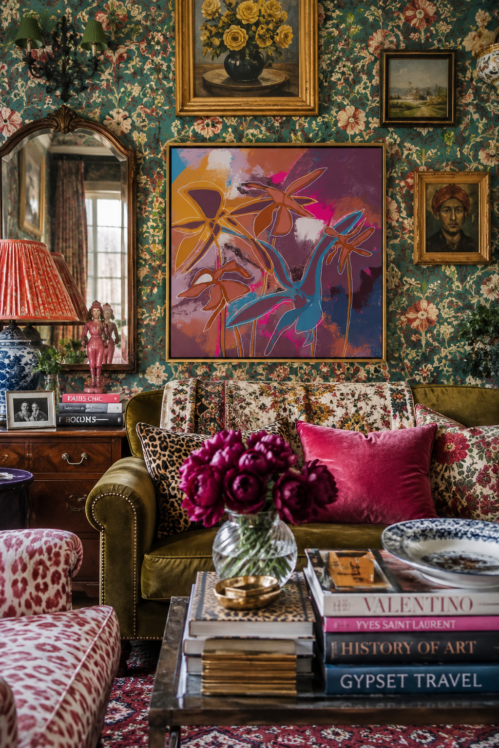
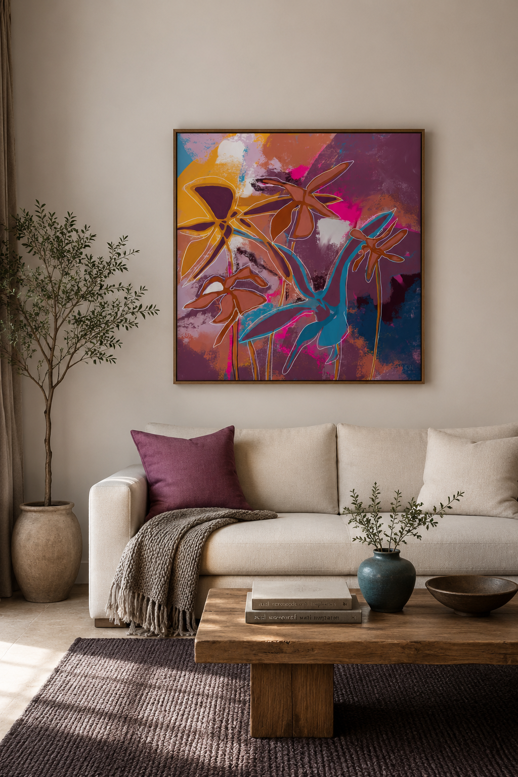
Here's a nuance worth sitting with: choosing bold art doesn't mean giving up on a calm room. People tend to assume the mood of the art is the mood of the room, full stop. It isn't. The room's mood comes from everything working together — the art is one voice in that conversation, not the only one.
A few ways to let bold art stay bold without overwhelming a room:
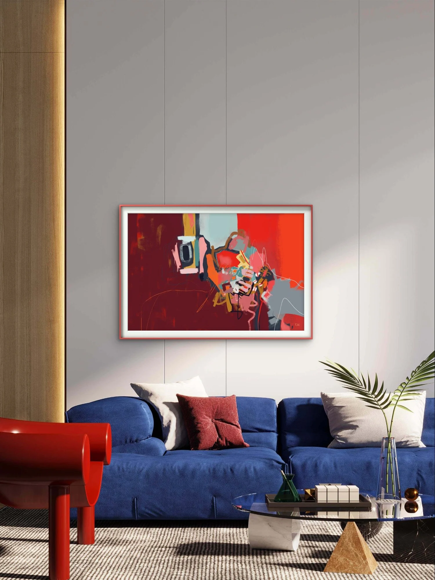
Echo a color. Pull one color from the piece and repeat it somewhere quieter in the room — a pillow, a vase, a picture frame. That small echo creates a thread between the art and the space, so it reads as connected instead of jarring.
Balance the visual weight. If the art carries a lot of visual weight on one side of a room, add weight elsewhere to balance it — a substantial chair, a floor plant, a dark rug. The eye needs somewhere else to land.
Give it negative space. Bold art breathes, and reads as calmer, when it isn't competing with clutter. The same piece on a clean, uncluttered wall feels intentional; surrounded by knick-knacks, it feels chaotic.
Keep the furniture quiet. Pairing bold art with simple, unfussy furniture keeps the art as the one loud voice in the room, instead of one loud thing shouting over several others.
The art sets the emotional high note. The rest of the room decides how loud that note actually feels.
One Room, Three Art Choices
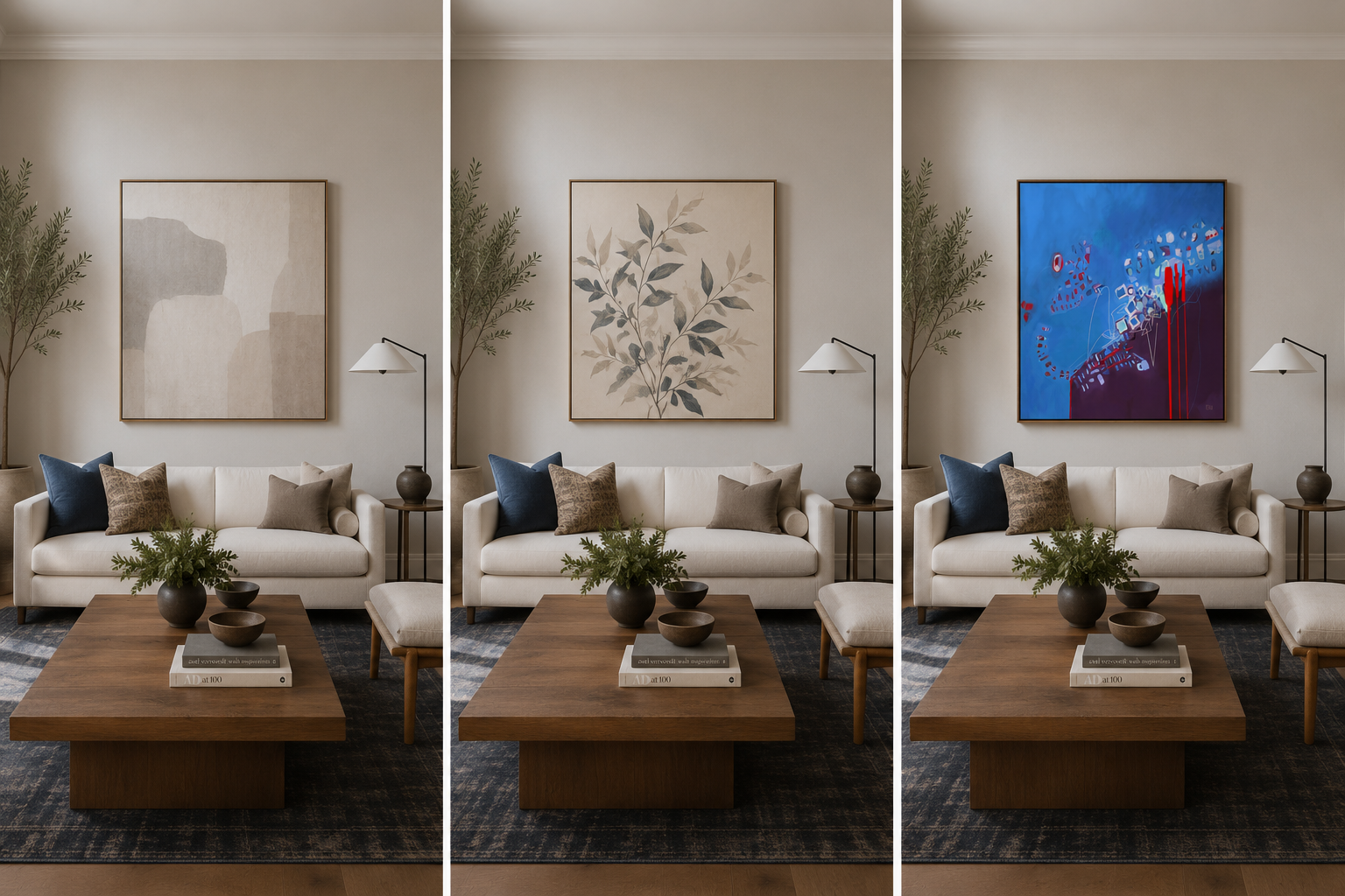
Let's make this concrete. Picture the same room, styled three different ways:
The generic print. Technically fine. Matches the palette. Adds absolutely nothing. You'd walk past it a thousand times and never really see it.
Art that matches the room's color, but not its style. Closer. It photographs fine. But something still feels a little flat — safe, coordinated, and slightly forgettable.
A piece that's mood-forward, not color-matched. It might not "go" with anything else in the room on paper. But it's the one that makes the room feel alive the second you walk in.
The first two are invisible. The third is the one people remember.
Why One Big Statement Piece Often Beats a Gallery Wall
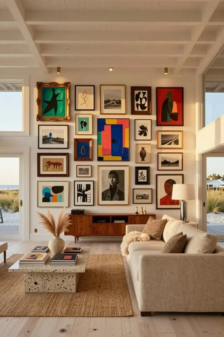
Gallery walls have their place, but if you're choosing between a wall of smaller, safer pieces and one large, bold piece — consider the big piece.
A single large statement work commits to one clear emotional idea. A gallery wall, by contrast, often splits your attention across several smaller ideas, none of which get to fully land. If you want a room to feel transformed rather than simply decorated, one confident piece will usually do more than a dozen scattered ones.
[IMAGE 8 — Before/after comparison: a gallery wall of smaller, safer pieces vs. one large statement piece in the same space. Mockups work fine here. Alt text: "Comparison of a gallery wall versus one large statement art piece"]
A Checklist for Choosing Art (Save This)
Before you buy, sit with these questions:
What mood do I want this room to hold?
Does it spark a memory, even one I can't quite name?
Would I still love this piece if it didn't match anything else in the room?
Does it have tension — something unresolved that keeps me looking?
Am I choosing this because it's pretty, or because it's interesting?
If it feels a little weird or uncomfortable, am I sitting with that before ruling it out?
Is this piece meant to be a bold statement or a quiet support — and does this room actually need that job done?
The Bottom Line
You don't need to know exactly why a piece works. You just need to notice that it does — and trust that instinct enough to let it hang somewhere you'll see it every day.
If something in the Wilding, Flux, or Within collections gives you that "huh" feeling, that's worth paying attention to. And if you're not ready to buy yet but want to see new pieces as they're added, the Studio List is the easiest way to stay in the loop.
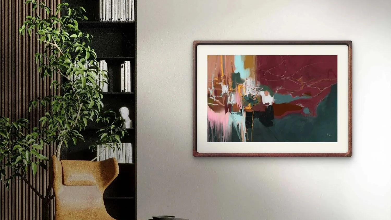
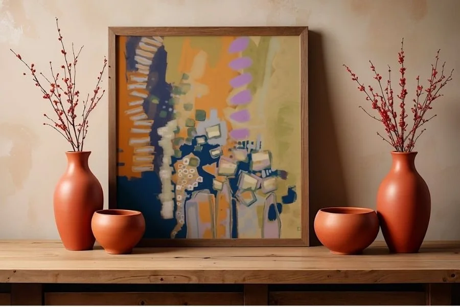
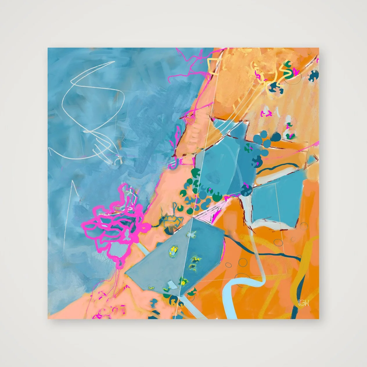
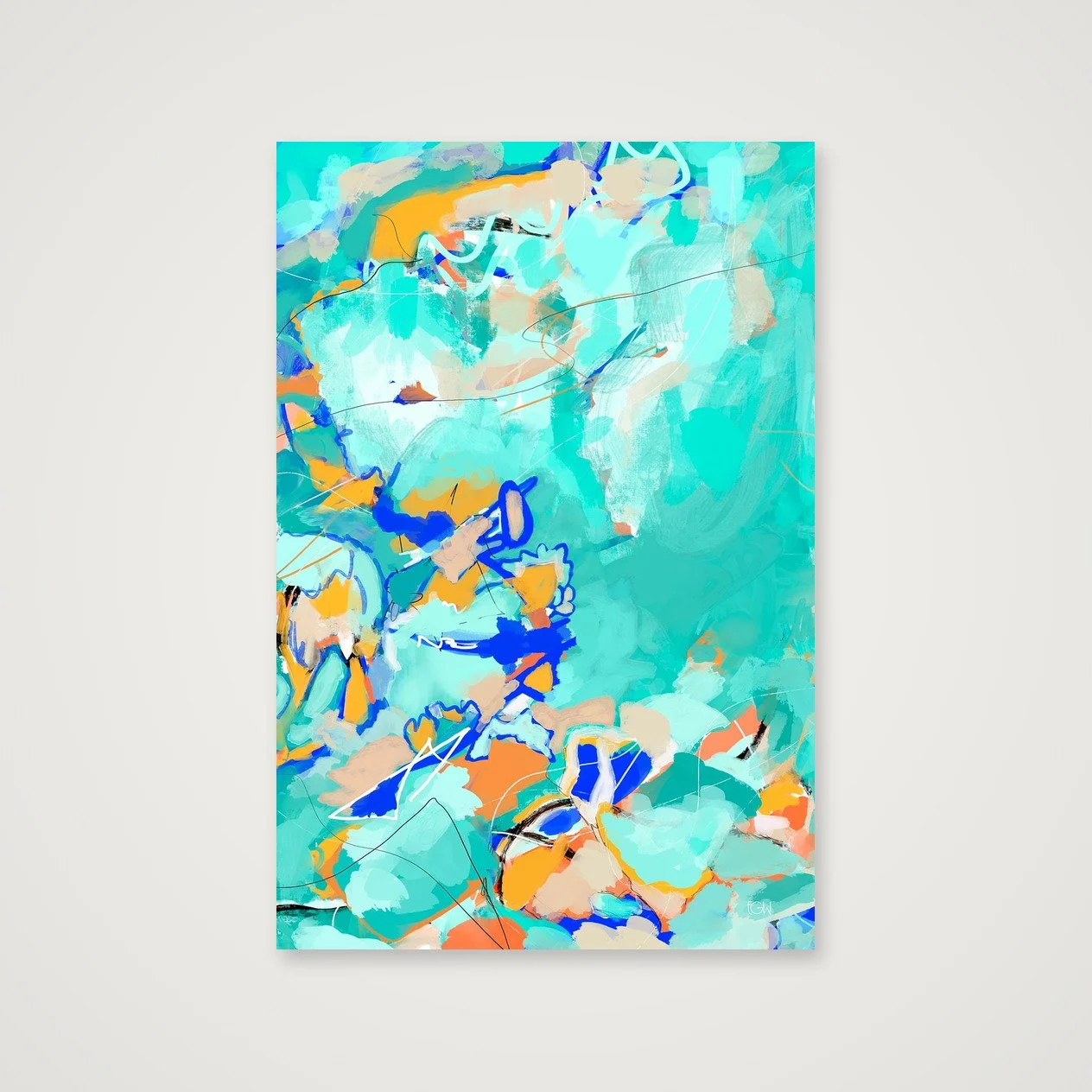
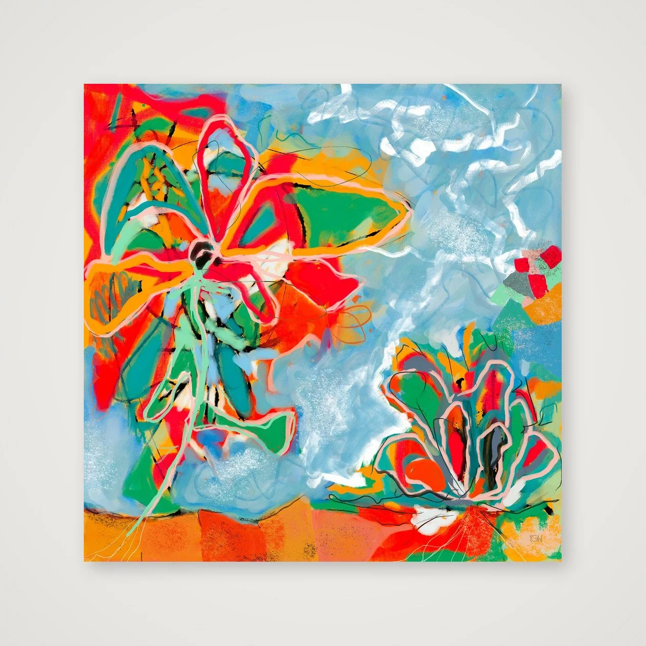
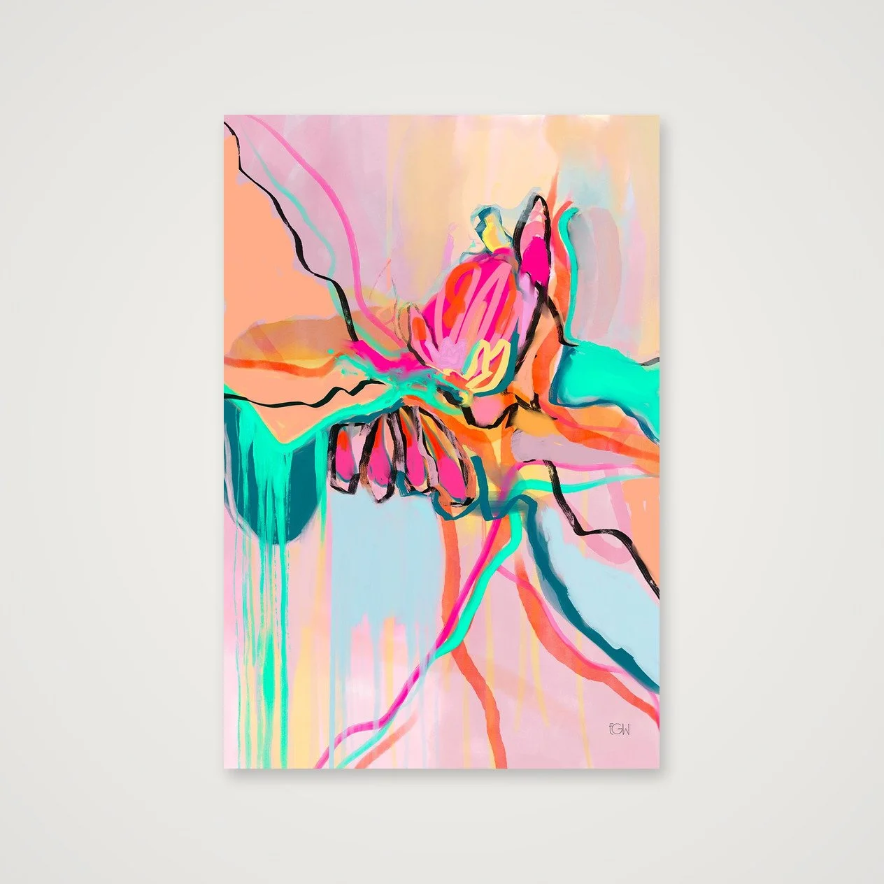
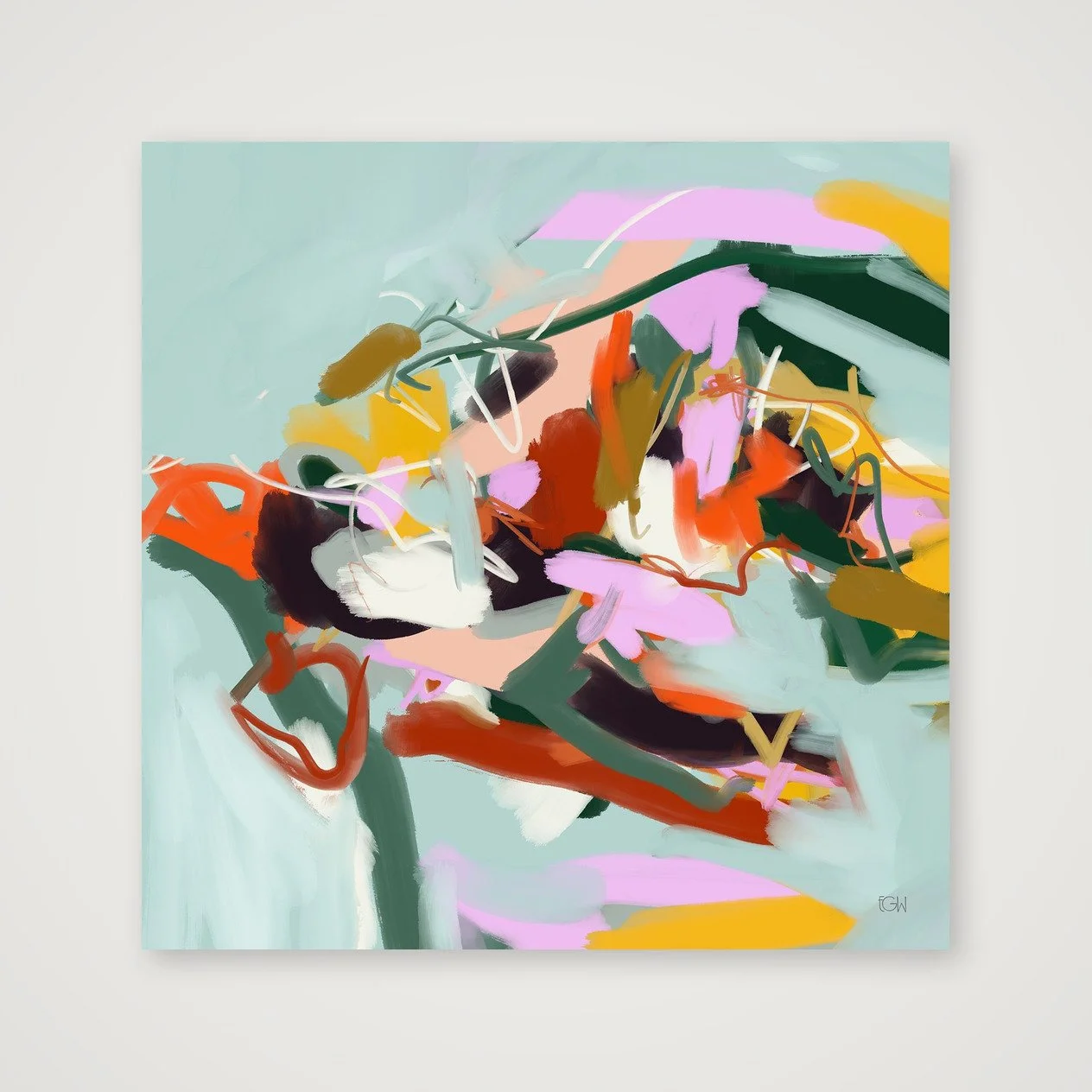
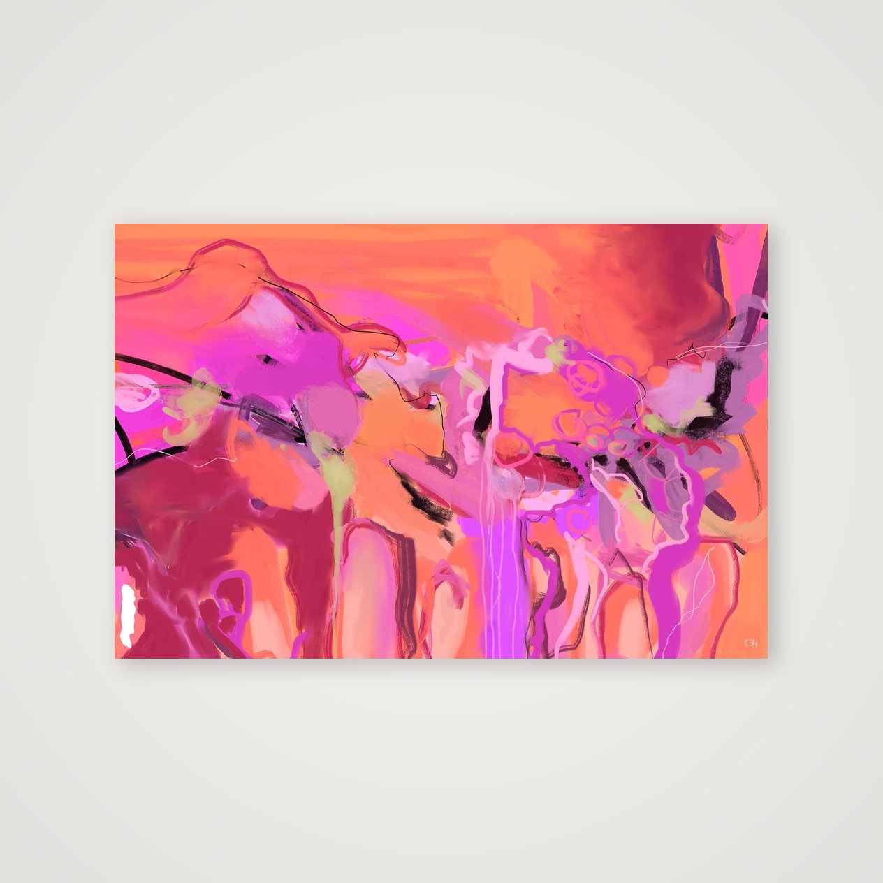
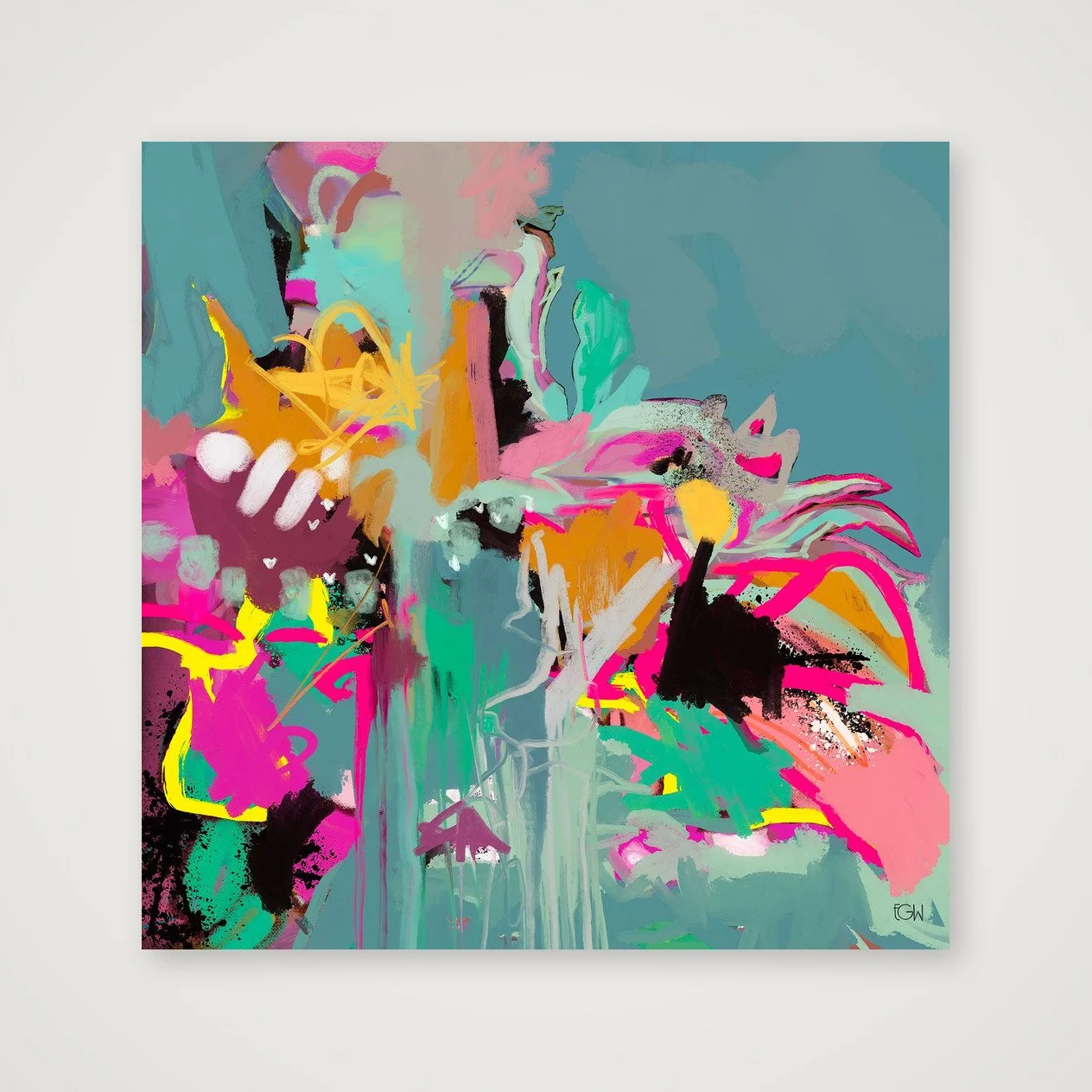
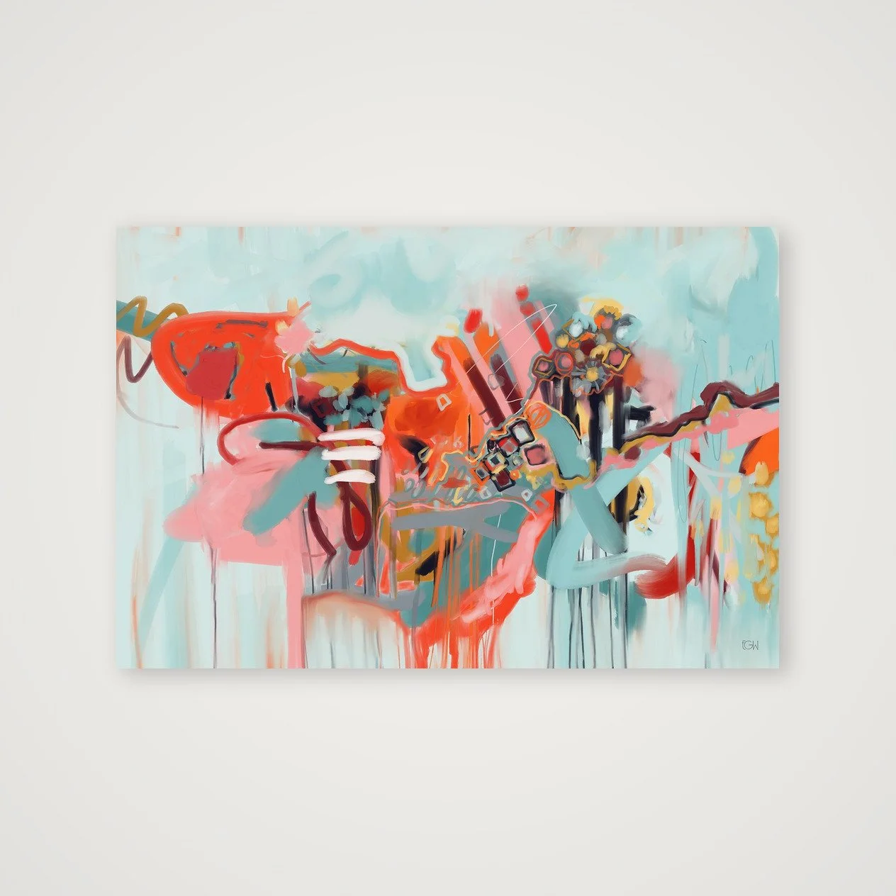
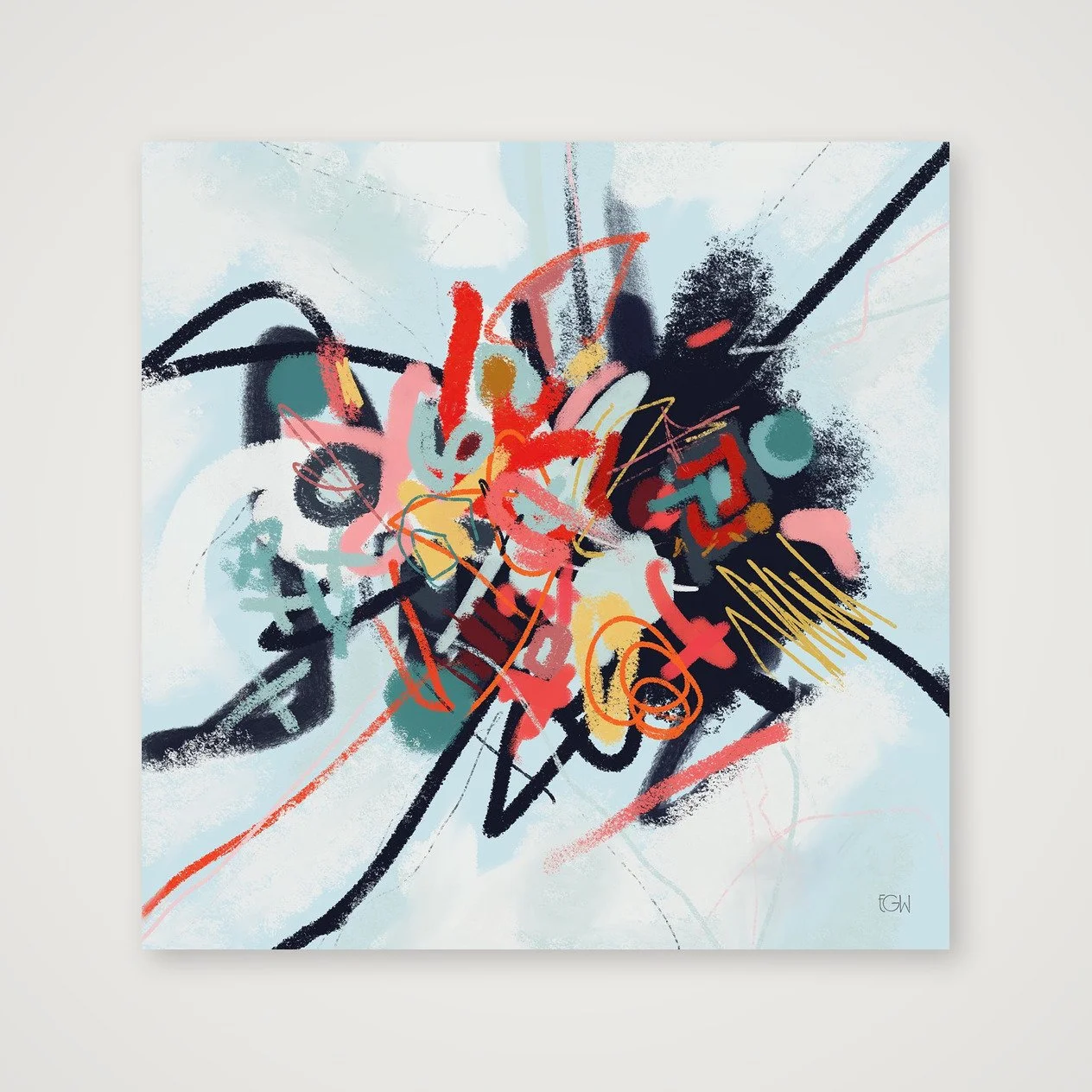
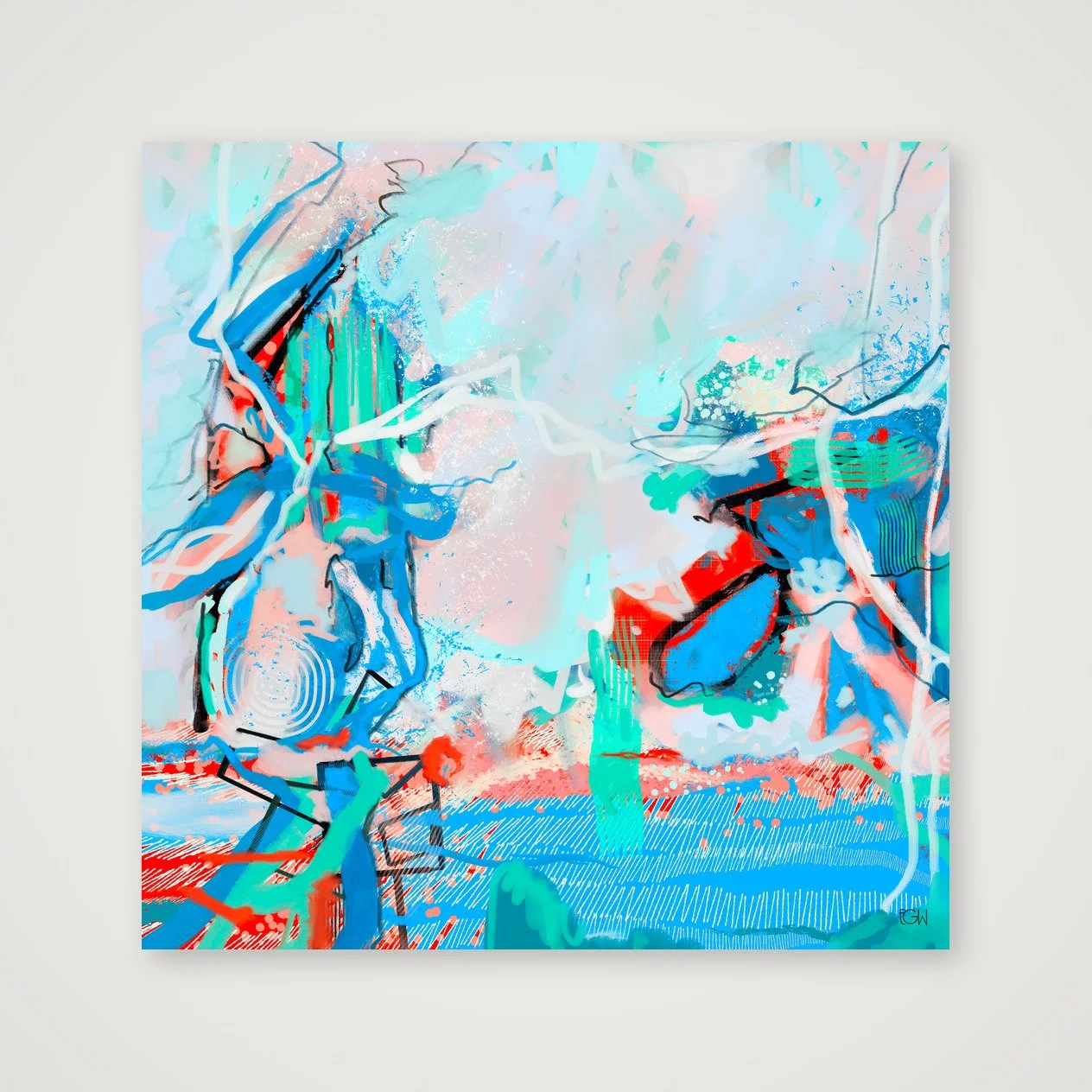
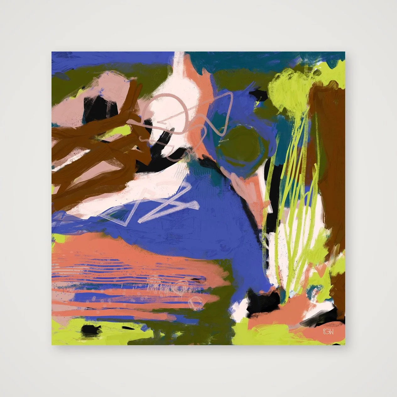
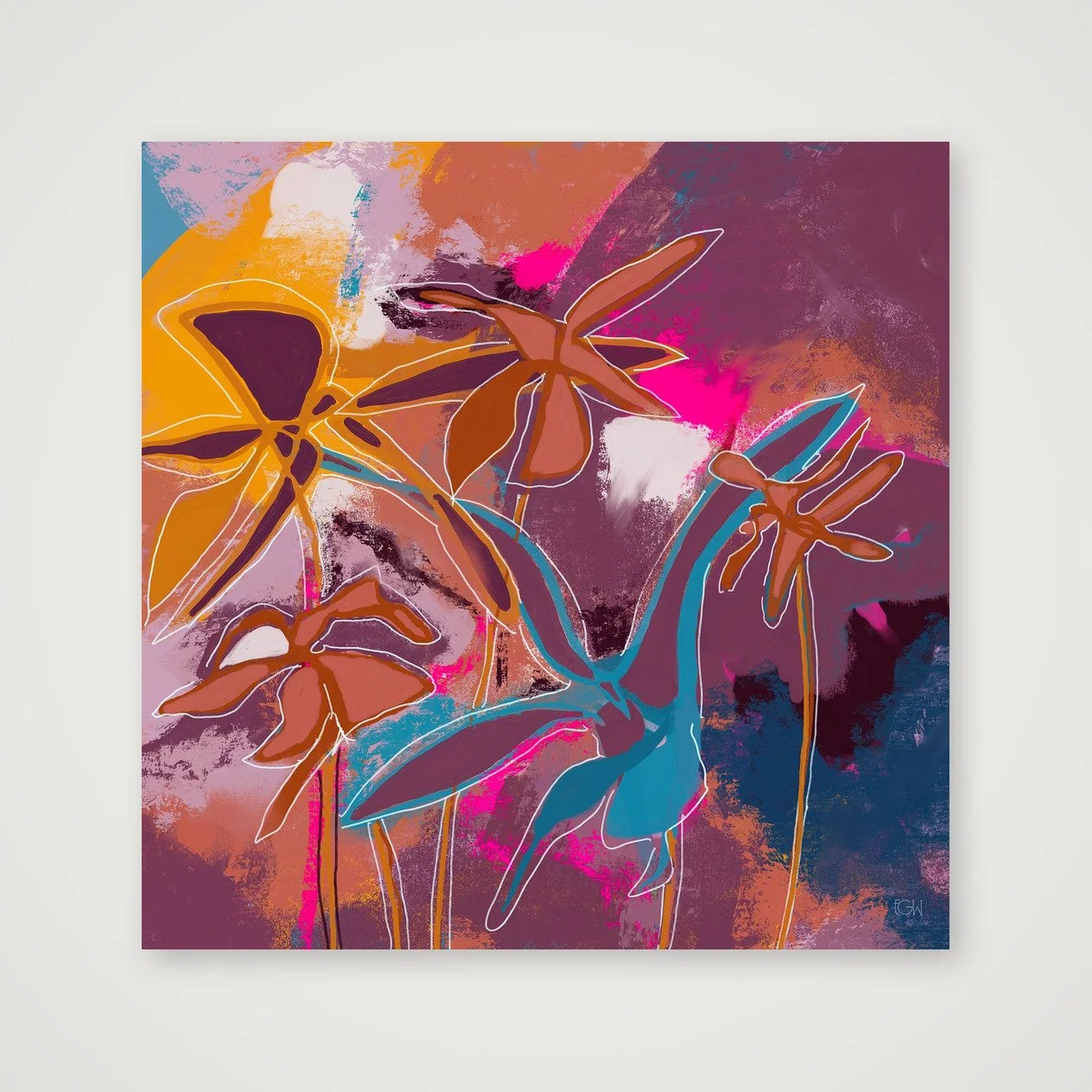
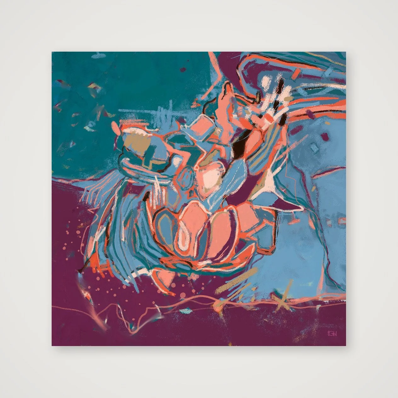
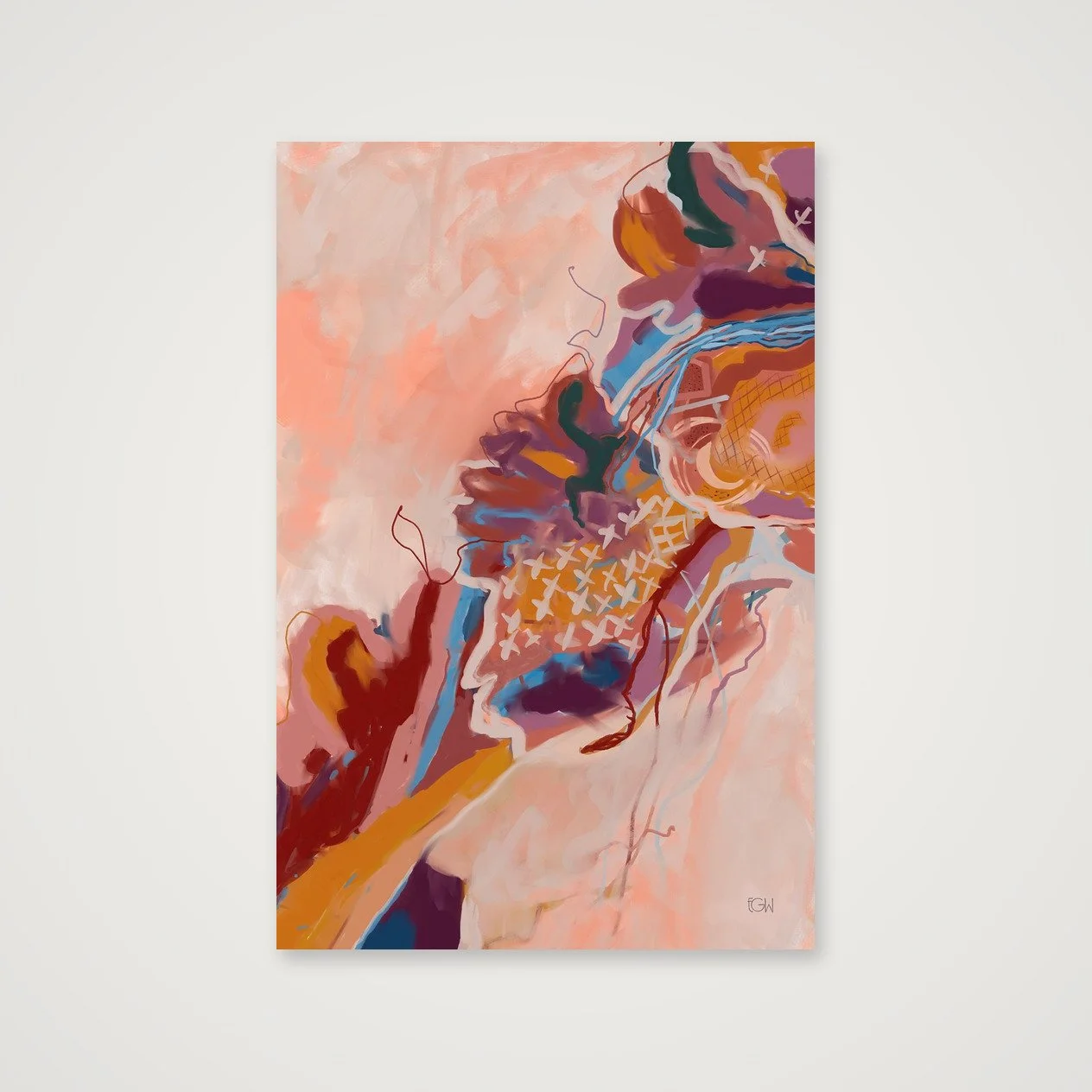
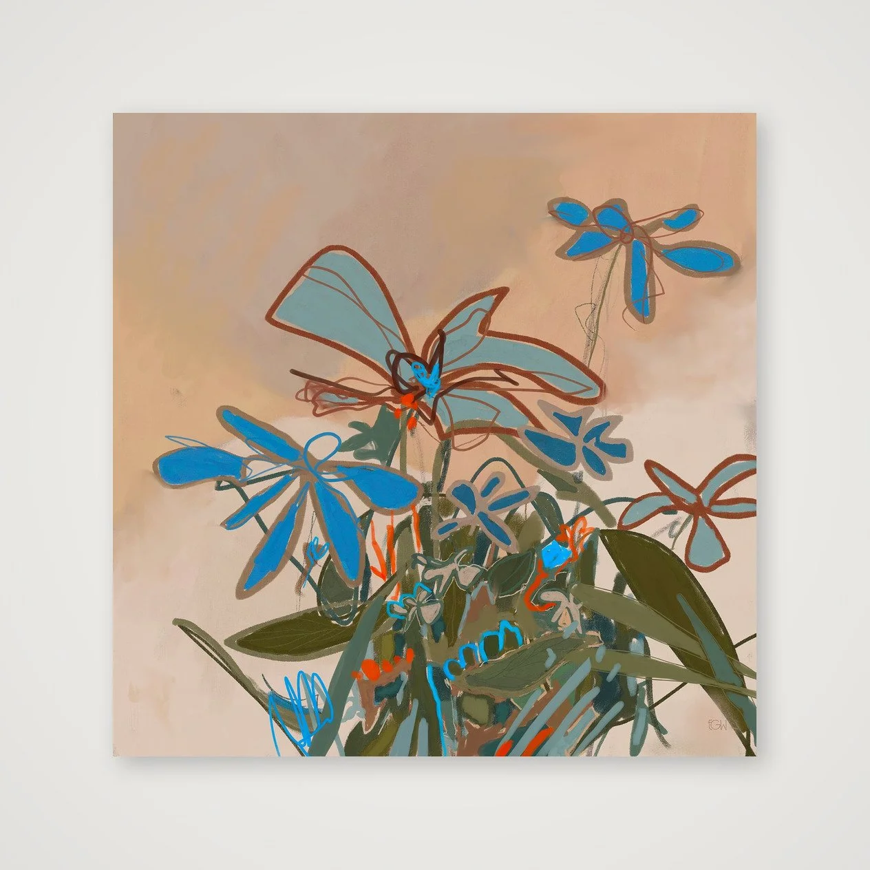
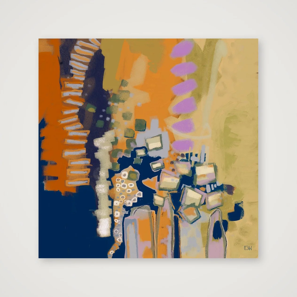
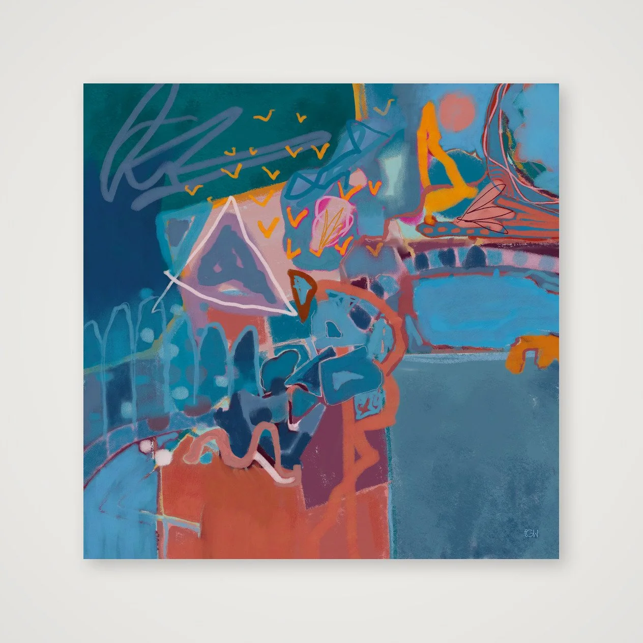
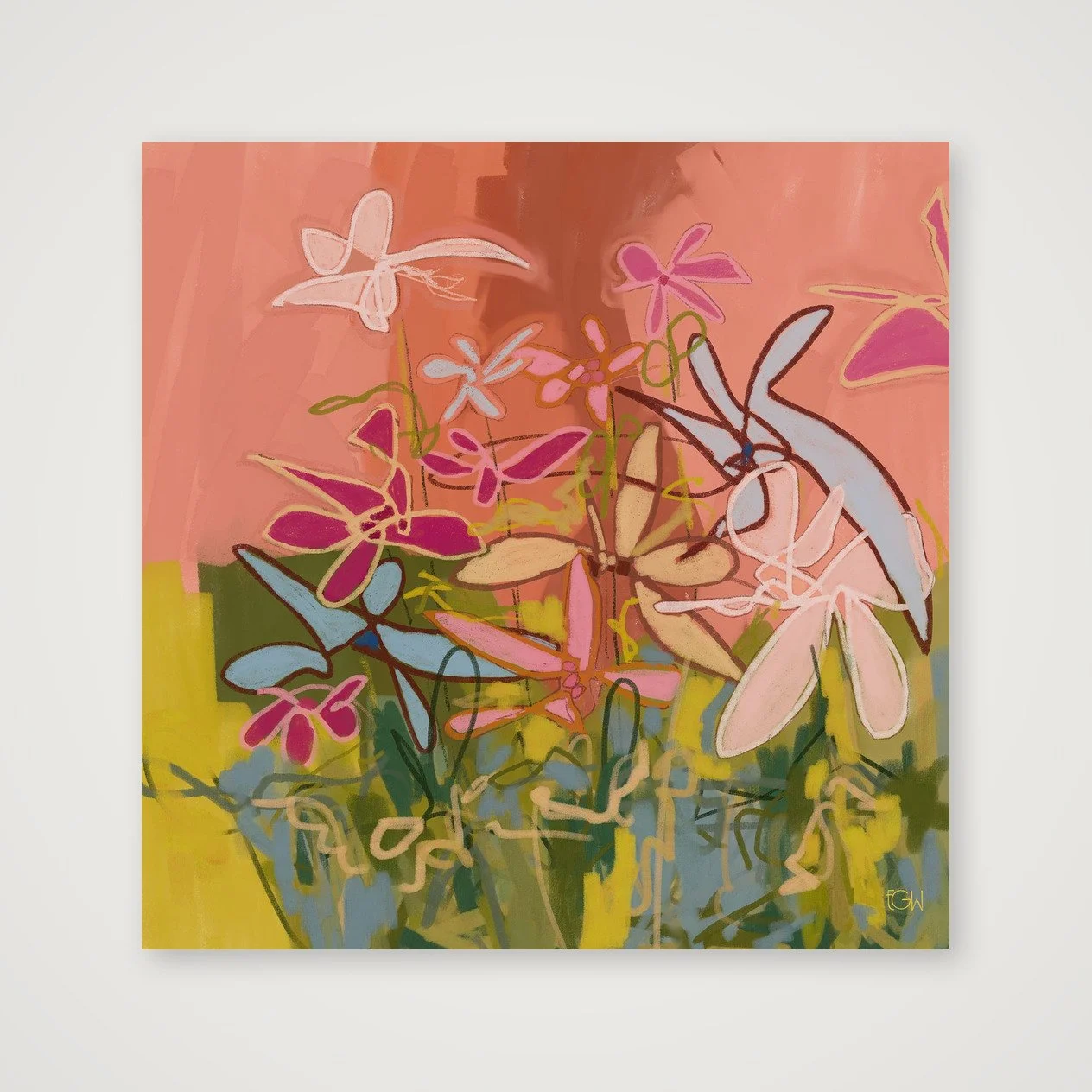
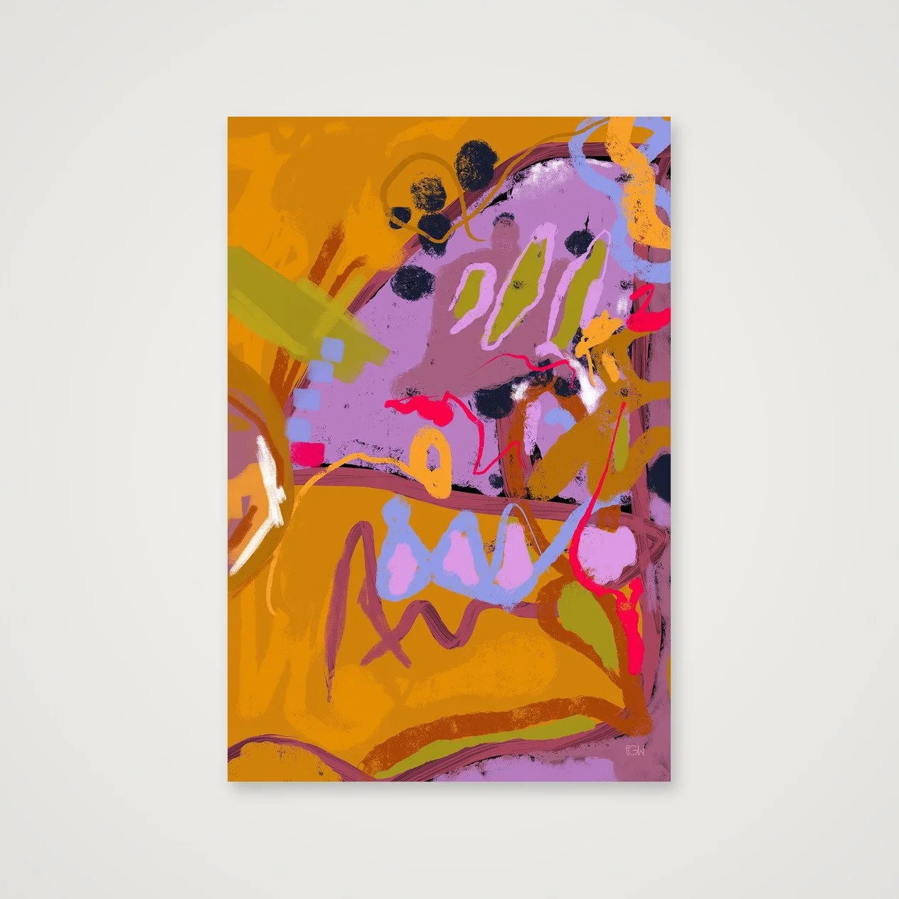
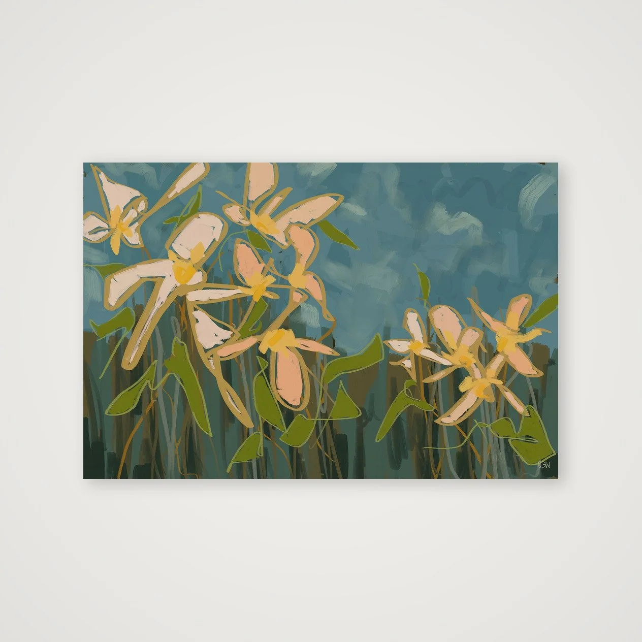
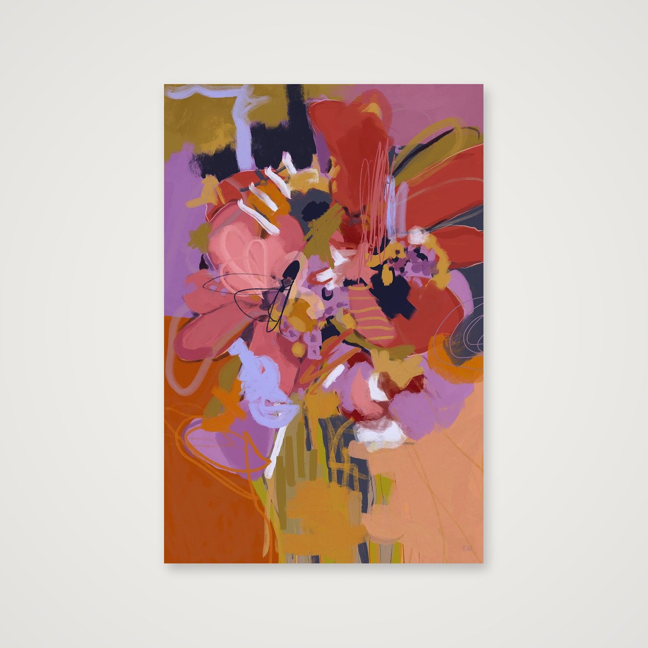
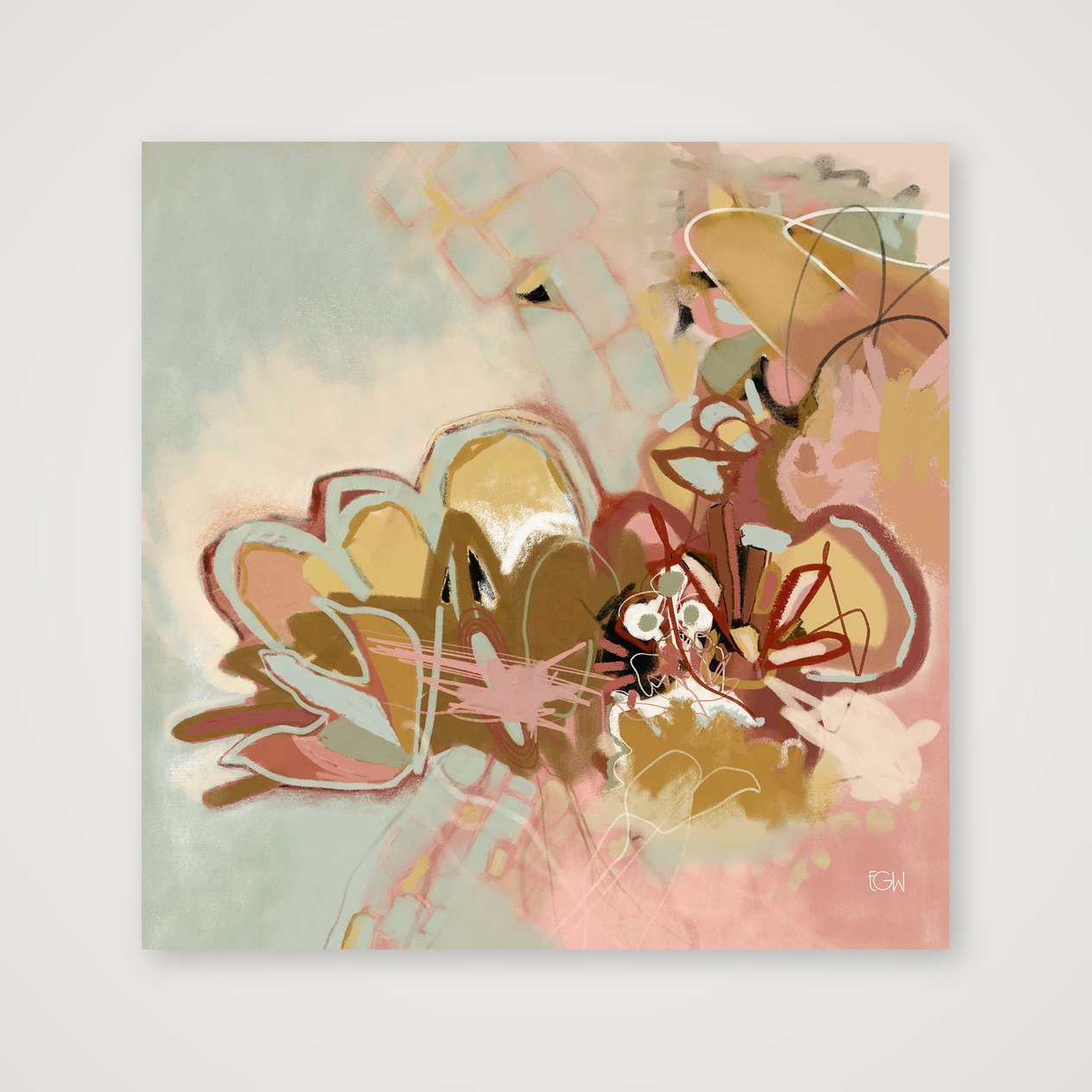
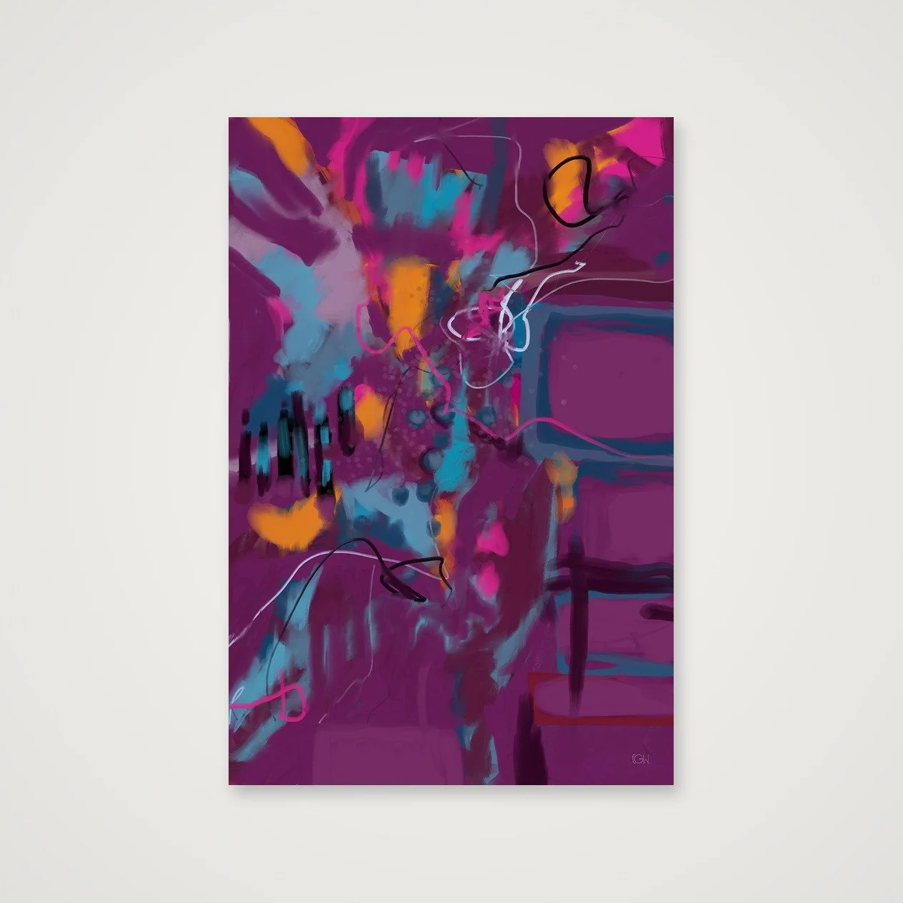
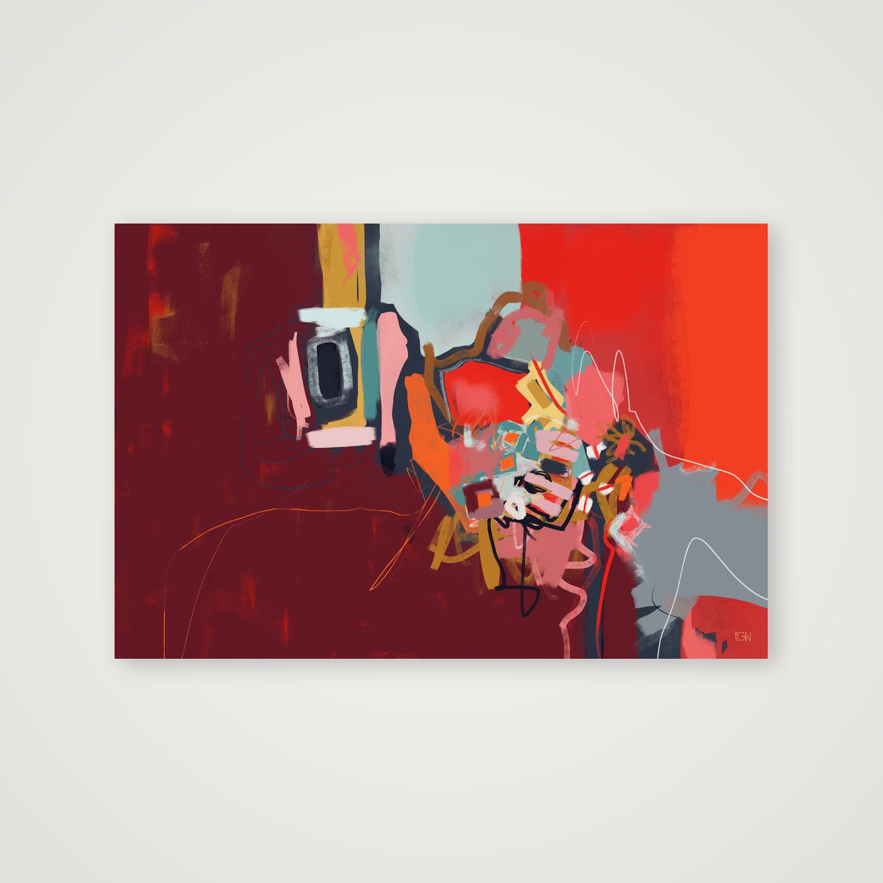
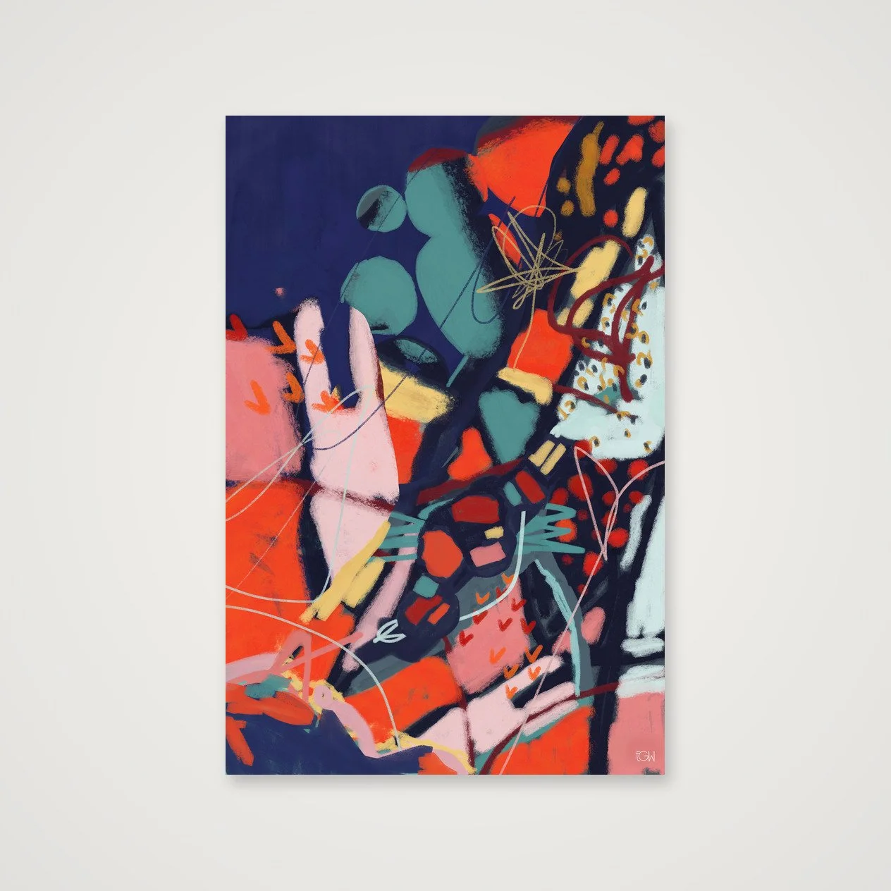
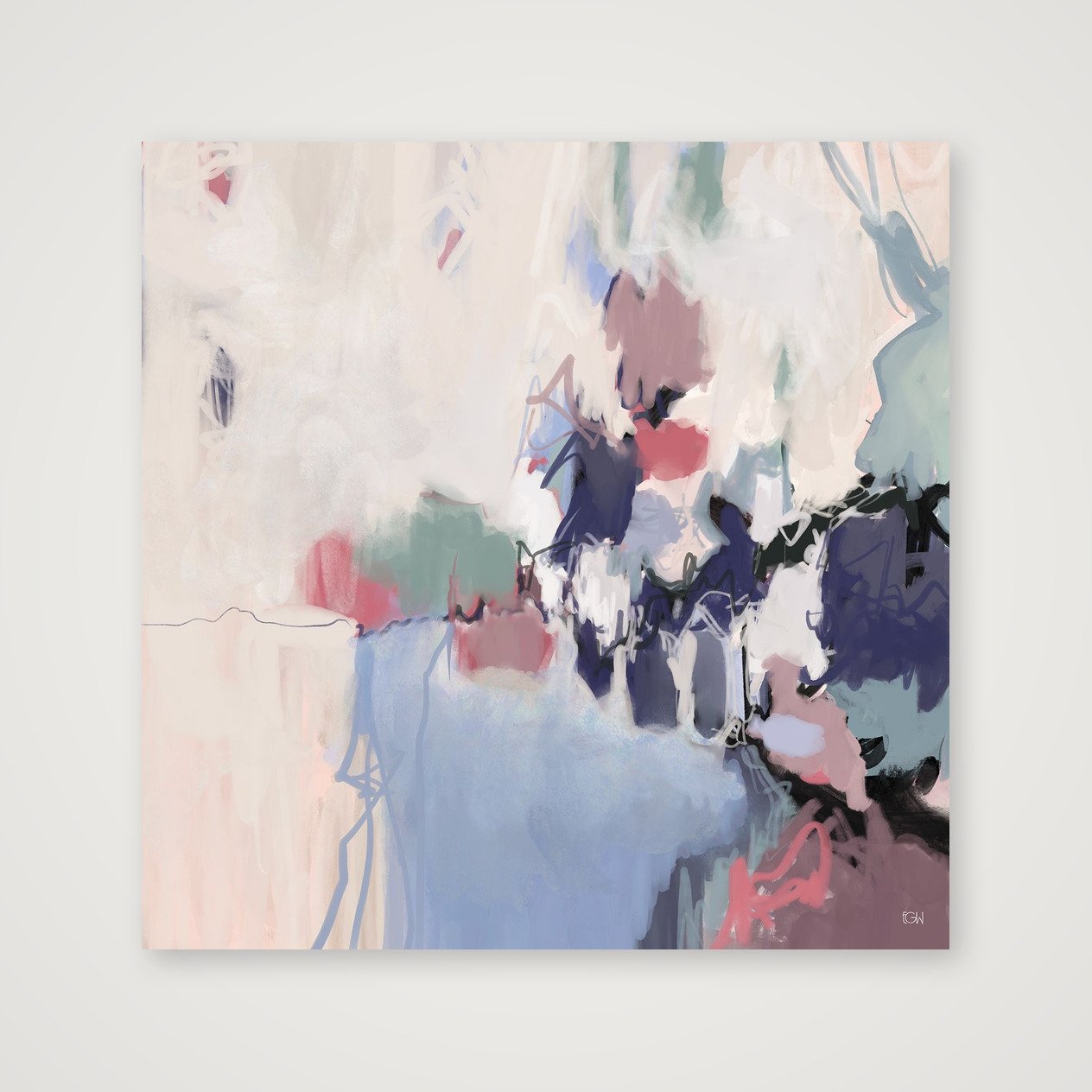
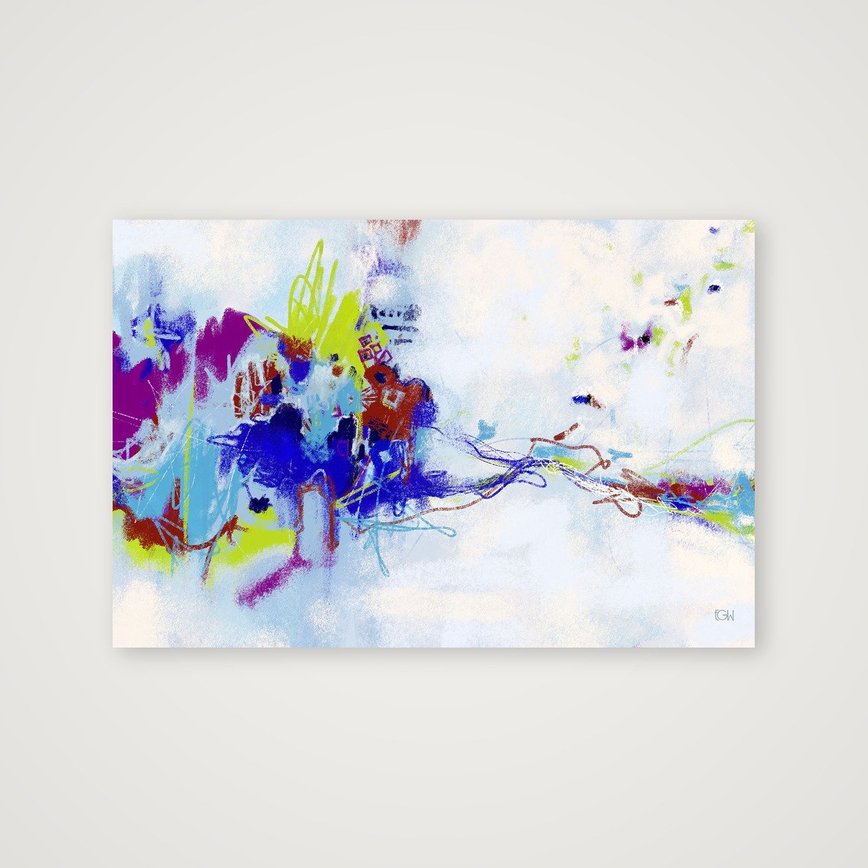
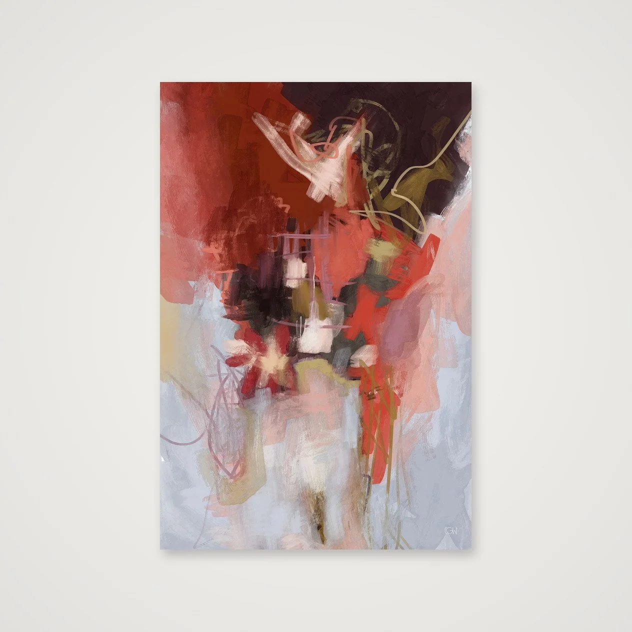
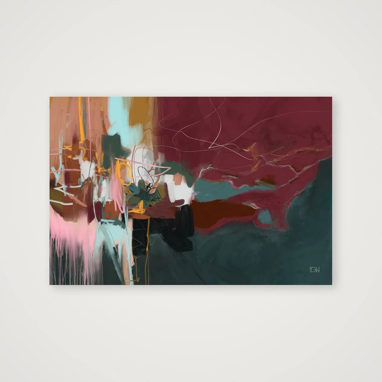


Created from original digital artwork by Emily Whitish.
Open edition
Professionally printed on museum-quality Hahnemühle Photo Rag 308 gsm using archival pigment inks
100% cotton, matte fine-art paper with a softly textured surface
Artwork is printed to the full listed dimensions with no added white border unless otherwise shown
Each print is digitally signed by the artist
Includes a Certificate of Authenticity
Optional frames are made from sustainably sourced solid wood and available in select sizes
Printed to order and shipped directly to you in protective, sustainable packaging
Each artwork is offered only in carefully selected sizes that preserve the original composition. Cropped or alternate aspect-ratio versions are not available.
Frames are available for select sizes only. Unframed prints are offered in both imperial and metric dimensions. If you plan to use custom framing, either format will work. If you’re using a ready-made frame, choose the size that best matches standard frame dimensions where you live.