The Psychology of Color: Why Certain Paintings Calm a Room and Others Energize It
The Psychology of Color: Why Certain Paintings Calm a Room and Others Energize It
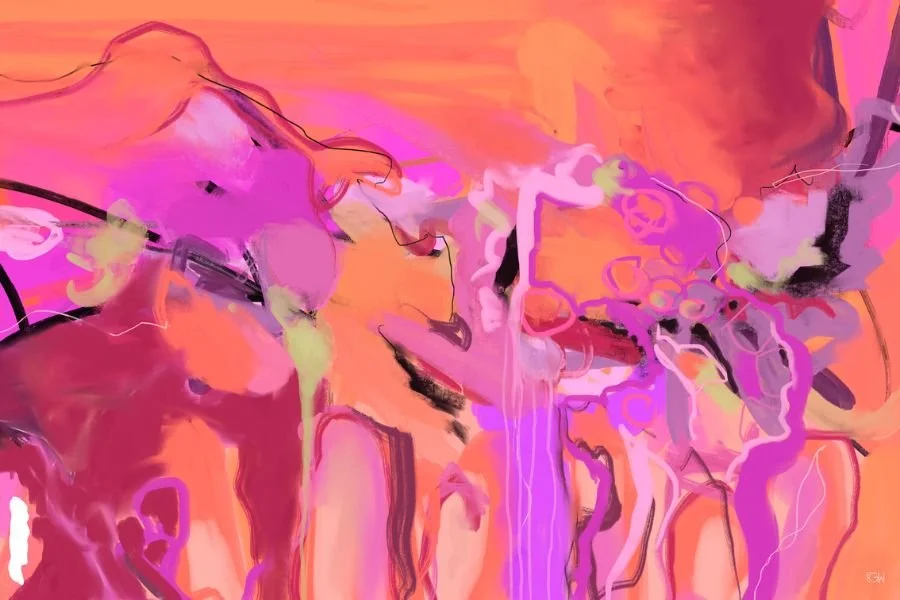
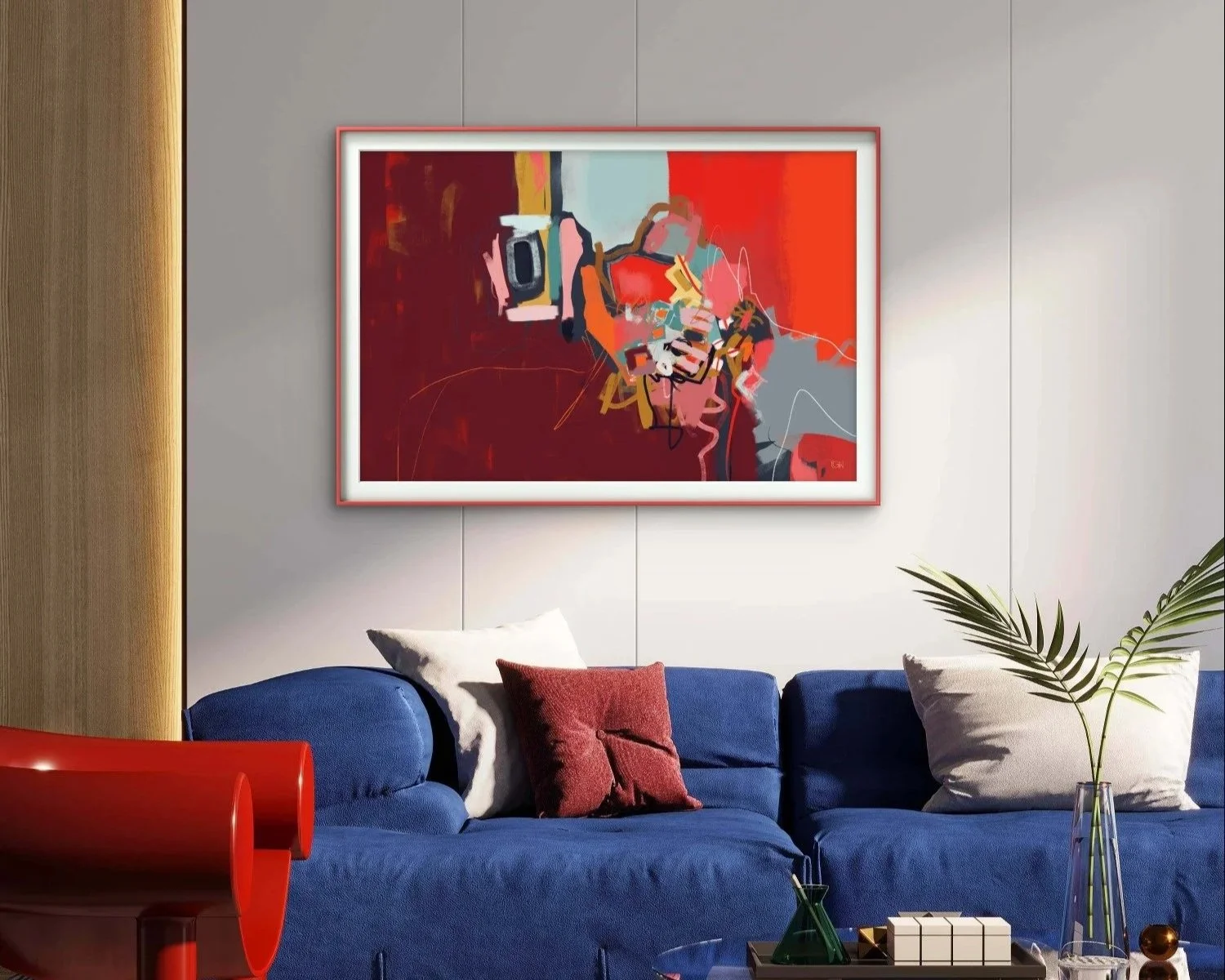
You have probably read some version of this before. Blue is calming. Red is energizing. Yellow makes people happy. Color psychology gets talked about like a lookup table, as if you could match a mood to a hex code and call it a day.
Here is the more honest version. Color does have a real emotional effect, and it also carries a cultural and associative one, shaped by memory and personal history in ways that rarely line up neatly across different people. Both things are true at once, which is exactly why the lookup table approach falls apart the moment you actually try to use it. Color psychology can get you partway there, but it cannot tell you what a room needs. Only your own response can do that.
Why I Don't Decorate by Color Psychology, Even Professionally
I have spent twenty years sitting across from people in a therapy room, and if there is one thing that experience has taught me about color, it is that people respond to it in wildly individual ways. There is no single palette that reliably reads as safe or calming to everyone who walks through the door. So I stopped trying to engineer that with color years ago.
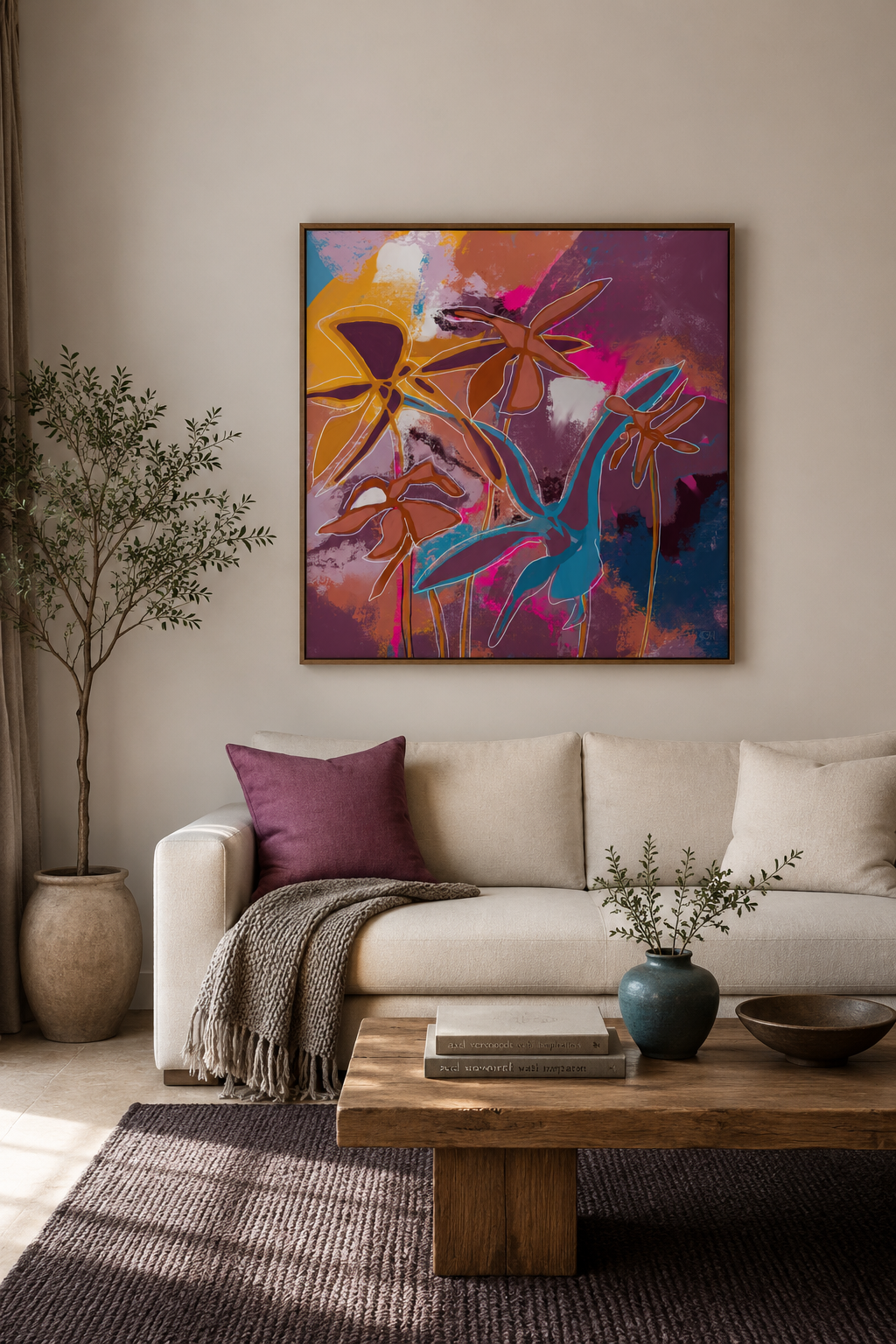
What I decorate for instead is authenticity. My space is unmistakably mine, blended with a few things I know will genuinely appeal to the people who sit in it, kept uncluttered and considered rather than staged. I lean abstract when I choose art for that room too, since abstract work leaves enough open space for someone to bring their own interpretation to it rather than being told exactly what to feel.
Different clients probably notice different things in that room. One might land on the art, another on the light, another on something else entirely. But the throughline stays the same no matter what catches their eye first. This person is exactly who they present as. What you see is what you get. And there is a real, felt sense of safety in that, one that starts working before either of you has said a word.
Why This Matters Beyond Aesthetics
This is not only a professional observation. It holds just as true at home. If your space does not actually reflect who you are, or if it constantly reminds you of everything left undone, it adds a quiet weight every time you walk into it. Home is supposed to be the place where you finally get to turn off, not another list of things you are managing without realizing it.
This is not about any particular color or style. It is about whether a space feels aligned with you or feels like background noise you have learned to tune out.
It's Personal: Two Stories About Color
My partner will tell you, without hesitation, that green is her favorite color. And yet there is not a single trace of green anywhere in our home. Instead it is blue and sea tones throughout, because that is what she associates with the calm she wants her home to hold. Her favorite color and the color that actually settles her nervous system turned out to be two entirely different things, which is a pretty good argument against decorating around a color simply because you love it in theory.
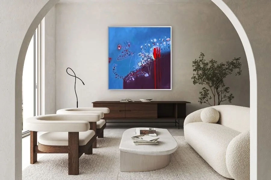
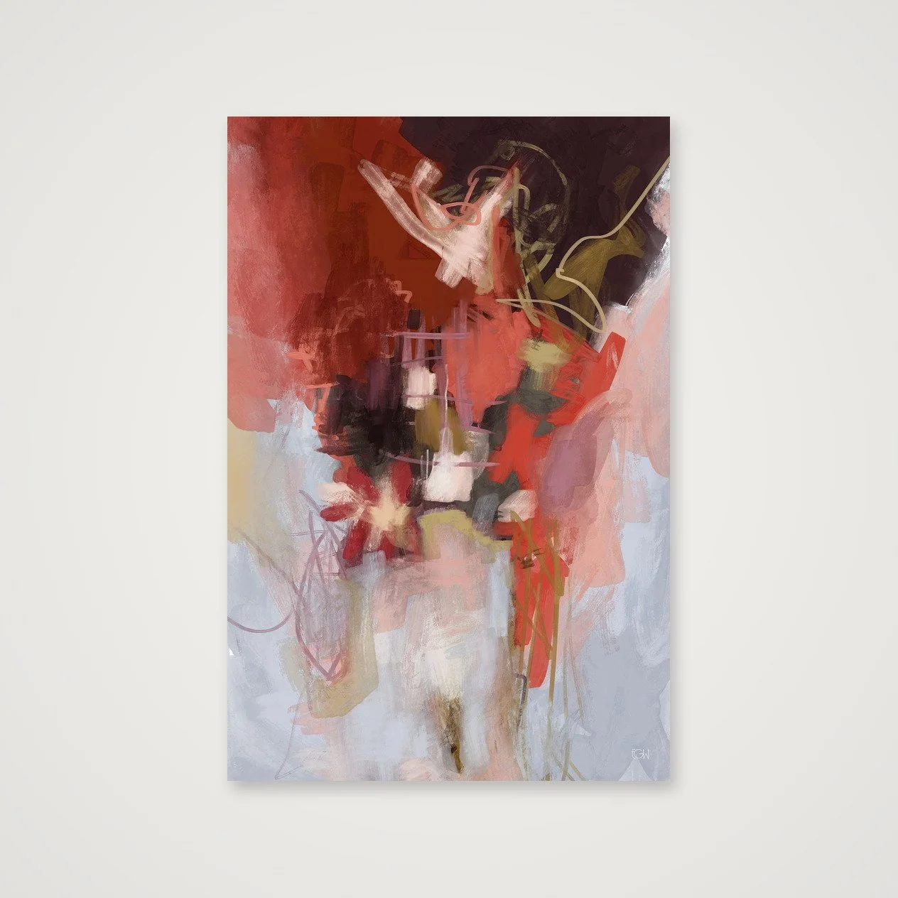
I have gone through my own version of this too, in the opposite direction. For years I avoided red almost entirely. It felt too loud, too angry, too much of a risk. Somewhere along the way I came around to it, and now I think a small, deliberate amount of red brings real life to a space, as long as it is placed with restraint rather than splashed everywhere. My relationship to that color did not shift because of a rule I read somewhere. It shifted because I paid closer attention to how I actually respond.
The Ugly-Pretty Problem: Understory as a Case Study
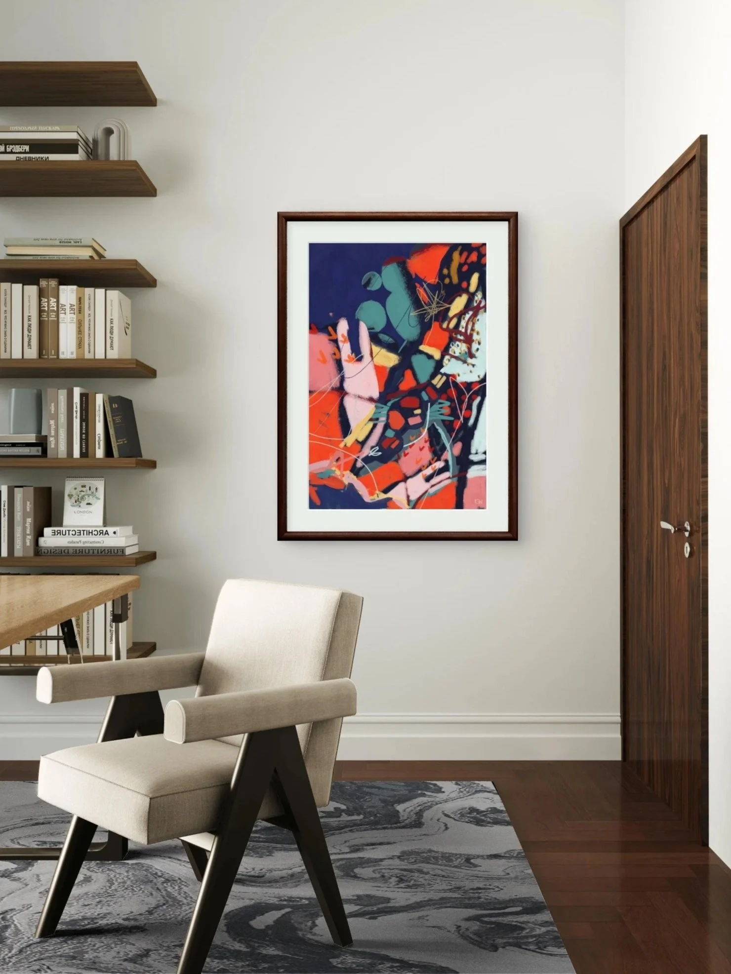
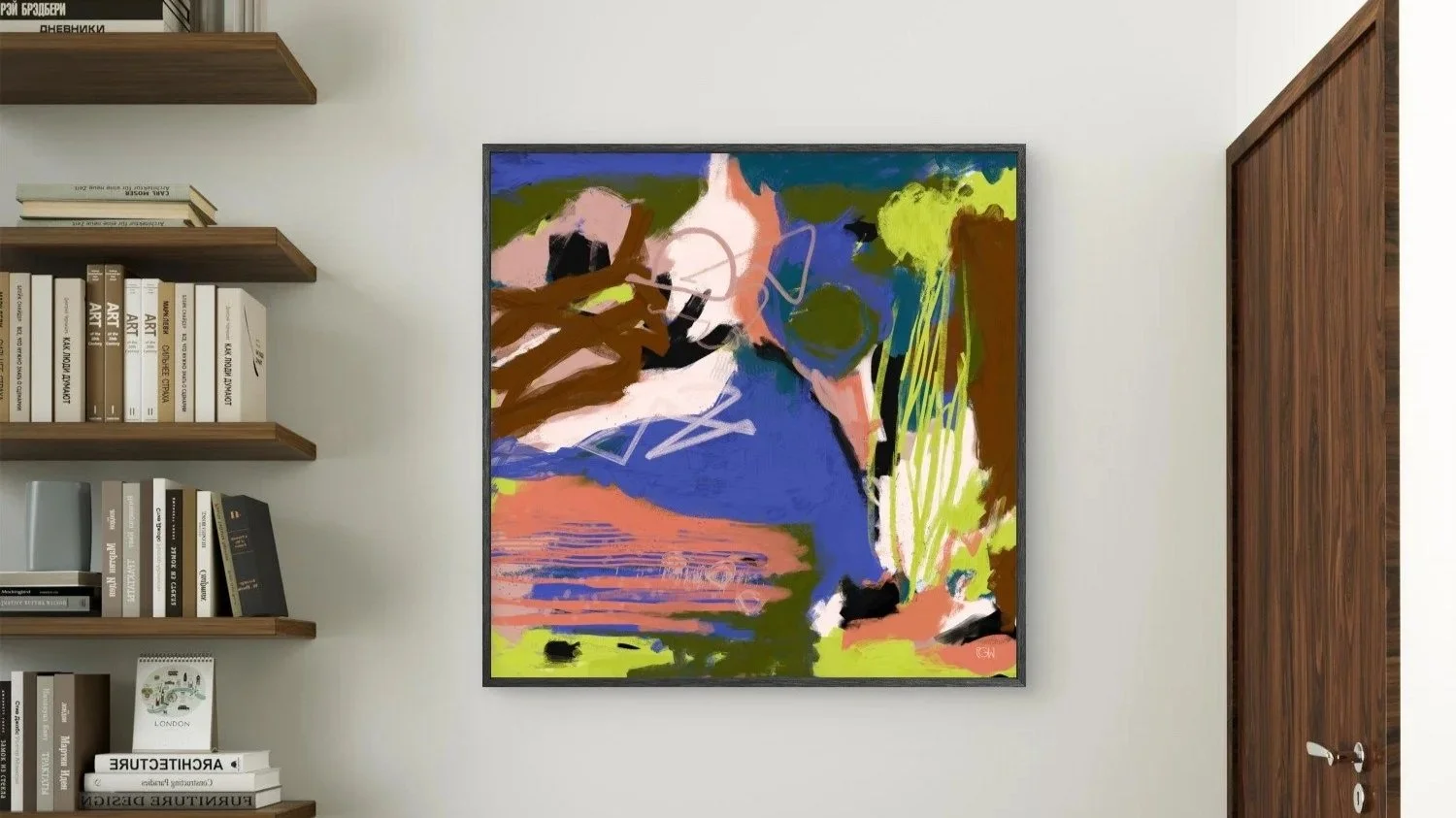
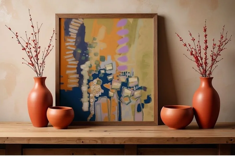
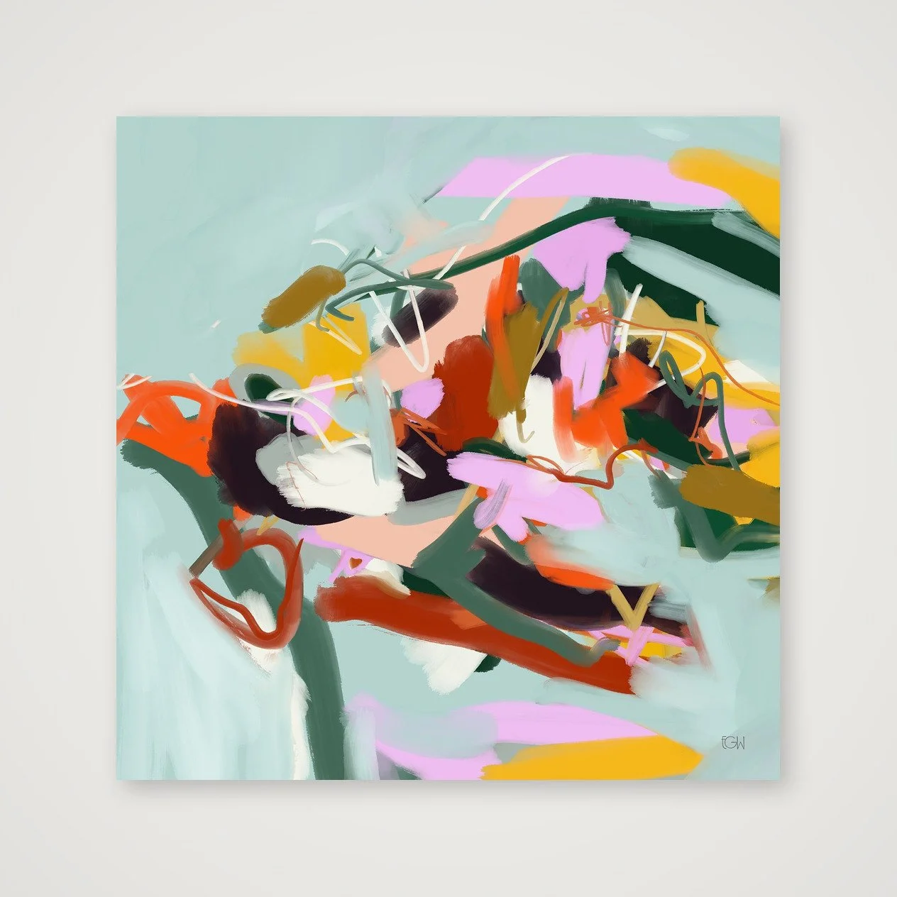
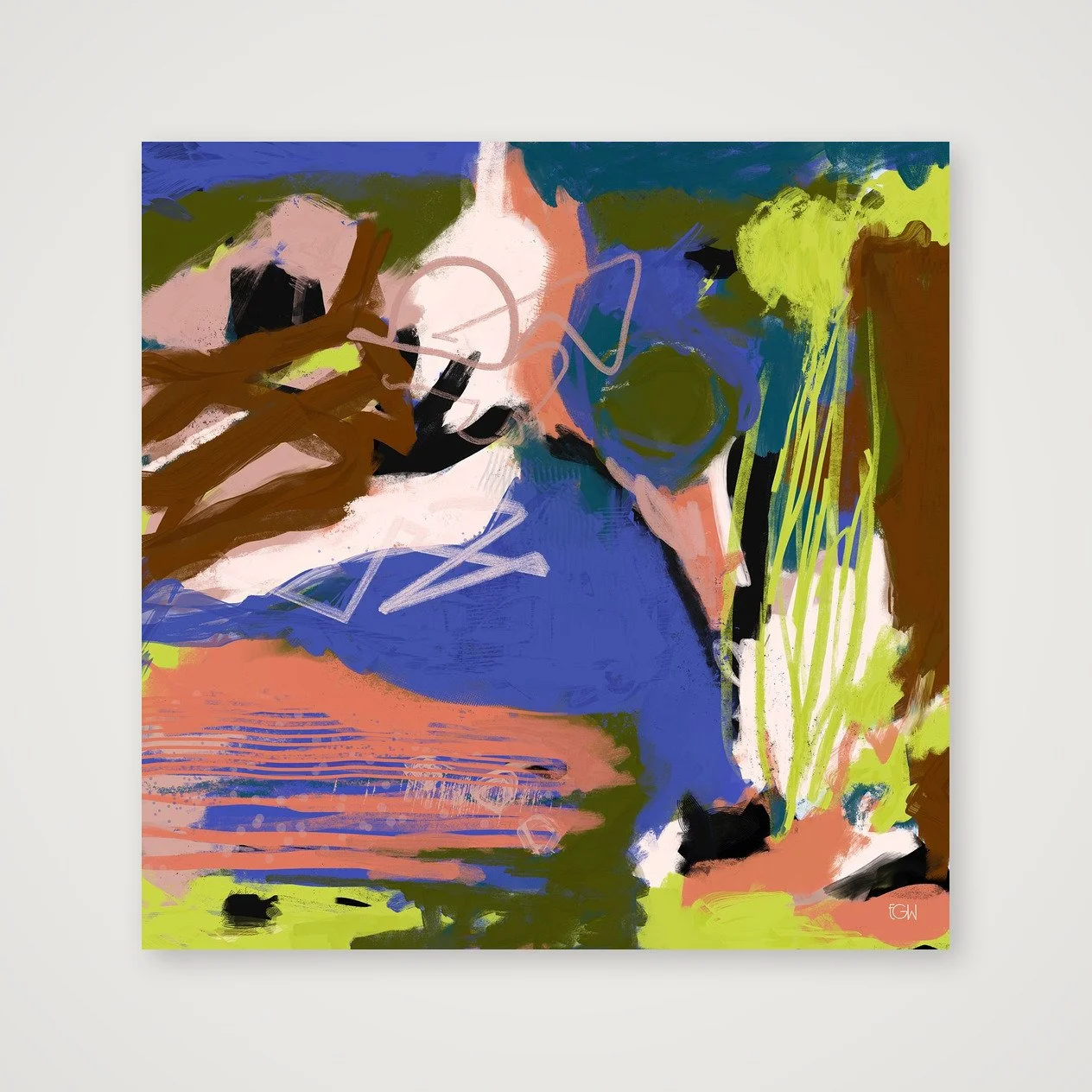
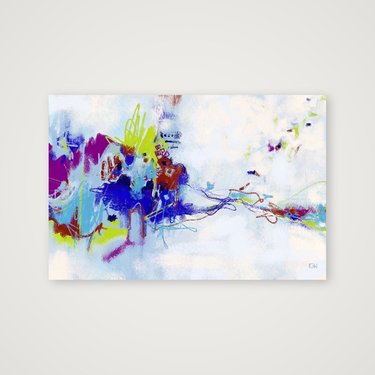
One of my paintings, Understory, is a good example of what color psychology tends to miss entirely.
At first glance, the composition reads as chaotic. There is a lot going on. But look a little longer and you can see it is actually quite controlled, built from distinct zones of color and movement, with one area doing the work of holding the rest together so nothing flies apart. The palette itself is a strange one on paper: electric chartreuse, coral, periwinkle, olive, petrol teal, chocolate brown, black, and a pale pink, sitting together in a combination that could easily read as obnoxious.
It does not, and the reason is restraint. Not restraint in the palette itself, which is anything but restrained, but restraint in how those colors are distributed across the canvas. Each color is doing just enough to make the others work, and no more. That is the ugly-pretty problem at the heart of a lot of my paintings, and it is also the answer to the question color psychology keeps trying to shortcut. It was never really about which colors you use. It is about the relationship between them, the same way a room is never really about which colors you choose, but about the relationship between the space and the person living in it.
So What Actually Makes a Room Feel Right
If color psychology can only take you partway, it helps to ask a few different questions instead of chasing the right palette.
Does this reflect something true about me, or something I think I am supposed to have. Am I drawn to this because I genuinely respond to it, or because it is supposed to be calming or energizing. Is there restraint somewhere in this room, even if the palette itself is bold. Does this space let me turn off, or does it add one more thing to notice and manage.
None of these questions have a universal answer, and that is sort of the point.
A Final Thought
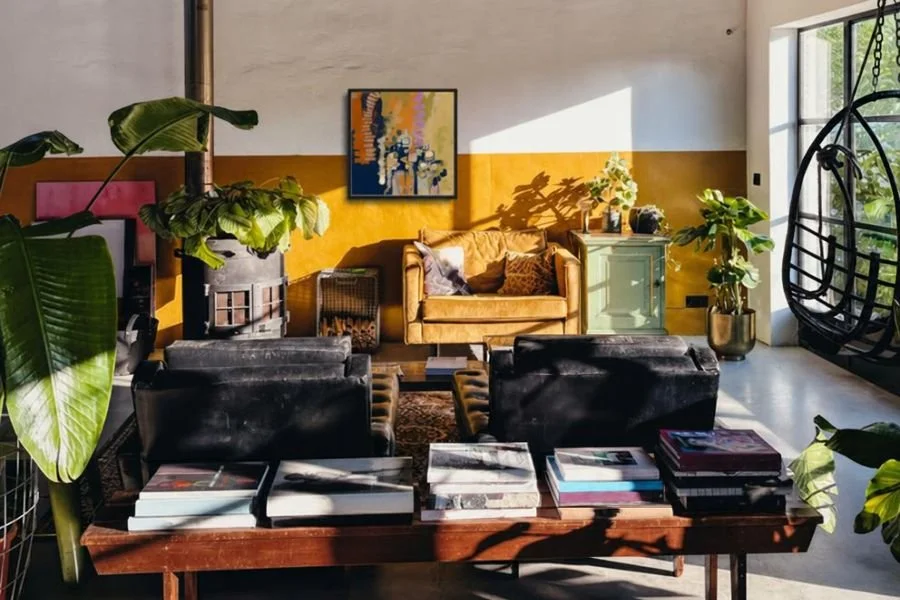
Color psychology is not wrong, exactly. It is just incomplete. It can point you in a general direction, but it cannot tell you what belongs in your home, because that answer is always going to be personal, shaped by your own history and your own associations rather than a chart anyone else could hand you.
If a piece like Understory speaks to that idea for you, you can find it here. And if you want to see new work as it is finished, the Studio List (below) is the easiest way to stay in the loop.
Created from original digital artwork by Emily Whitish.
Open edition
Professionally printed on museum-quality Hahnemühle Photo Rag 308 gsm using archival pigment inks
100% cotton, matte fine-art paper with a softly textured surface
Artwork is printed to the full listed dimensions with no added white border unless otherwise shown
Each print is digitally signed by the artist
Includes a Certificate of Authenticity
Optional frames are made from sustainably sourced solid wood and available in select sizes
Printed to order and shipped directly to you in protective, sustainable packaging
Each artwork is offered only in carefully selected sizes that preserve the original composition. Cropped or alternate aspect-ratio versions are not available.
Frames are available for select sizes only. Unframed prints are offered in both imperial and metric dimensions. If you plan to use custom framing, either format will work. If you’re using a ready-made frame, choose the size that best matches standard frame dimensions where you live.
Created from original digital artwork by Emily Whitish.
Open edition
Professionally printed on museum-quality Hahnemühle Photo Rag 308 gsm using archival pigment inks
100% cotton, matte fine-art paper with a softly textured surface
Artwork is printed to the full listed dimensions with no added white border unless otherwise shown
Each print is digitally signed by the artist
Includes a Certificate of Authenticity
Optional frames are made from sustainably sourced solid wood and available in select sizes
Printed to order and shipped directly to you in protective, sustainable packaging
Each artwork is offered only in carefully selected sizes that preserve the original composition. Cropped or alternate aspect-ratio versions are not available.
Frames are available for select sizes only. Unframed prints are offered in both imperial and metric dimensions. If you plan to use custom framing, either format will work. If you’re using a ready-made frame, choose the size that best matches standard frame dimensions where you live.
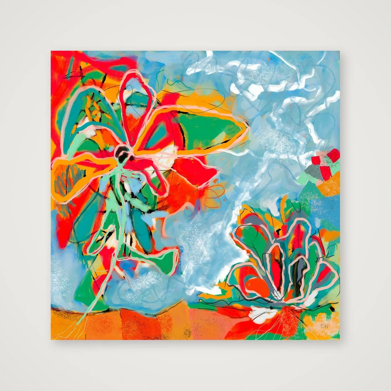
Created from original digital artwork by Emily Whitish.
Open edition
Professionally printed on museum-quality Hahnemühle Photo Rag 308 gsm using archival pigment inks
100% cotton, matte fine-art paper with a softly textured surface
Artwork is printed to the full listed dimensions with no added white border unless otherwise shown
Each print is digitally signed by the artist
Includes a Certificate of Authenticity
Optional frames are made from sustainably sourced solid wood and available in select sizes
Printed to order and shipped directly to you in protective, sustainable packaging
Each artwork is offered only in carefully selected sizes that preserve the original composition. Cropped or alternate aspect-ratio versions are not available.
Frames are available for select sizes only. Unframed prints are offered in both imperial and metric dimensions. If you plan to use custom framing, either format will work. If you’re using a ready-made frame, choose the size that best matches standard frame dimensions where you live.
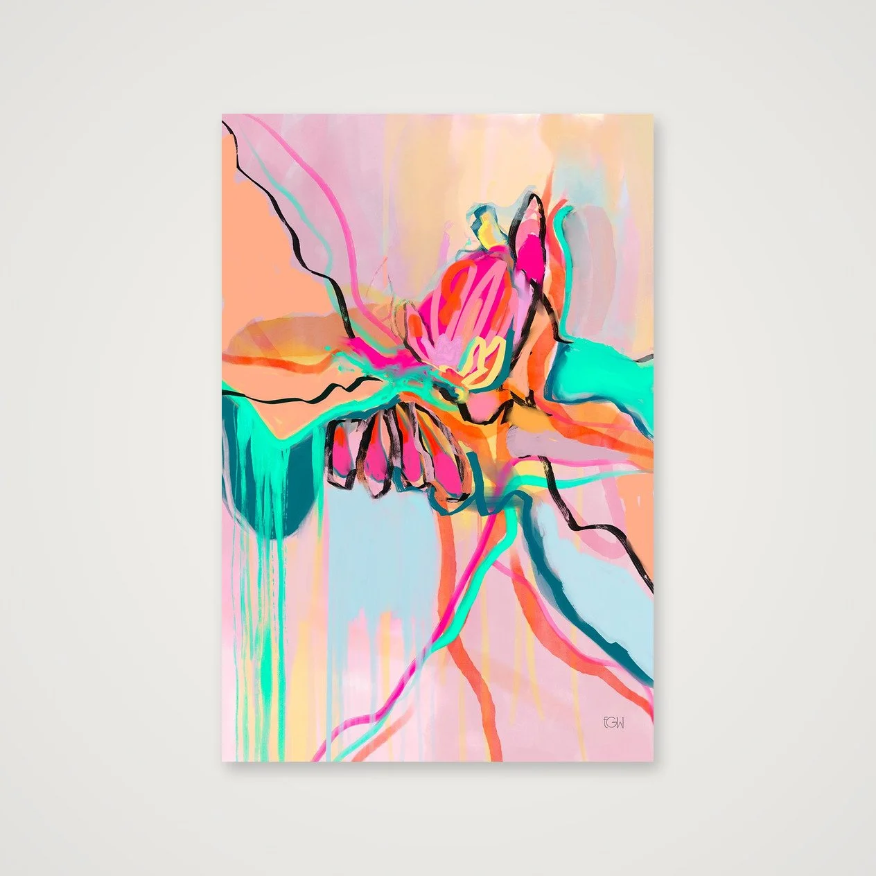
Created from original digital artwork by Emily Whitish.
Open edition
Professionally printed on museum-quality Hahnemühle Photo Rag 308 gsm using archival pigment inks
100% cotton, matte fine-art paper with a softly textured surface
Artwork is printed to the full listed dimensions with no added white border unless otherwise shown
Each print is digitally signed by the artist
Includes a Certificate of Authenticity
Optional frames are made from sustainably sourced solid wood and available in select sizes
Printed to order and shipped directly to you in protective, sustainable packaging
Each artwork is offered only in carefully selected sizes that preserve the original composition. Cropped or alternate aspect-ratio versions are not available.
Frames are available for select sizes only. Unframed prints are offered in both imperial and metric dimensions. If you plan to use custom framing, either format will work. If you’re using a ready-made frame, choose the size that best matches standard frame dimensions where you live.
Created from original digital artwork by Emily Whitish.
Open edition
Professionally printed on museum-quality Hahnemühle Photo Rag 308 gsm using archival pigment inks
100% cotton, matte fine-art paper with a softly textured surface
Artwork is printed to the full listed dimensions with no added white border unless otherwise shown
Each print is digitally signed by the artist
Includes a Certificate of Authenticity
Optional frames are made from sustainably sourced solid wood and available in select sizes
Printed to order and shipped directly to you in protective, sustainable packaging
Each artwork is offered only in carefully selected sizes that preserve the original composition. Cropped or alternate aspect-ratio versions are not available.
Frames are available for select sizes only. Unframed prints are offered in both imperial and metric dimensions. If you plan to use custom framing, either format will work. If you’re using a ready-made frame, choose the size that best matches standard frame dimensions where you live.
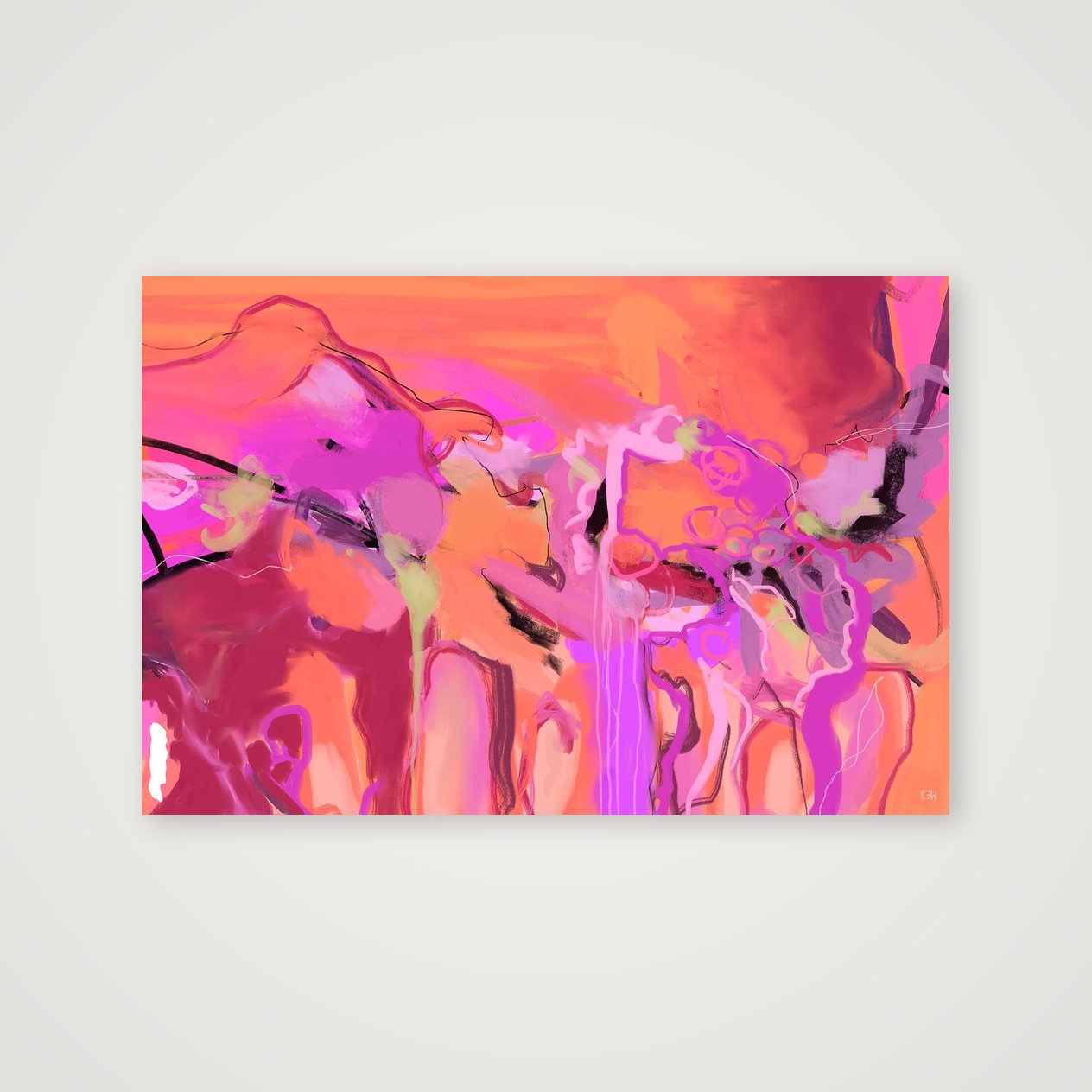
Created from original digital artwork by Emily Whitish.
Open edition
Professionally printed on museum-quality Hahnemühle Photo Rag 308 gsm using archival pigment inks
100% cotton, matte fine-art paper with a softly textured surface
Artwork is printed to the full listed dimensions with no added white border unless otherwise shown
Each print is digitally signed by the artist
Includes a Certificate of Authenticity
Optional frames are made from sustainably sourced solid wood and available in select sizes
Printed to order and shipped directly to you in protective, sustainable packaging
Each artwork is offered only in carefully selected sizes that preserve the original composition. Cropped or alternate aspect-ratio versions are not available.
Frames are available for select sizes only. Unframed prints are offered in both imperial and metric dimensions. If you plan to use custom framing, either format will work. If you’re using a ready-made frame, choose the size that best matches standard frame dimensions where you live.
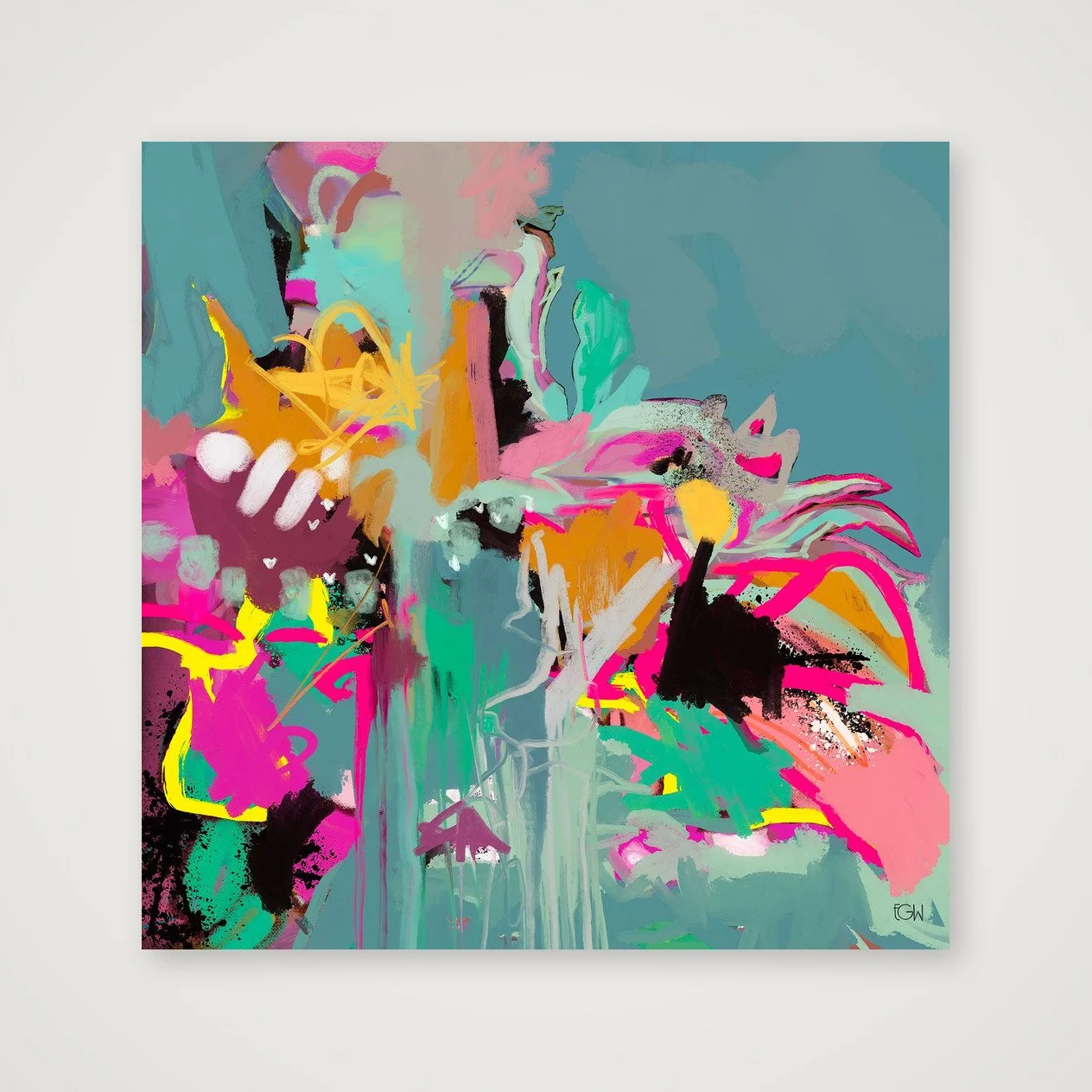
Created from original digital artwork by Emily Whitish.
Open edition
Professionally printed on museum-quality Hahnemühle Photo Rag 308 gsm using archival pigment inks
100% cotton, matte fine-art paper with a softly textured surface
Artwork is printed to the full listed dimensions with no added white border unless otherwise shown
Each print is digitally signed by the artist
Includes a Certificate of Authenticity
Optional frames are made from sustainably sourced solid wood and available in select sizes
Printed to order and shipped directly to you in protective, sustainable packaging
Each artwork is offered only in carefully selected sizes that preserve the original composition. Cropped or alternate aspect-ratio versions are not available.
Frames are available for select sizes only. Unframed prints are offered in both imperial and metric dimensions. If you plan to use custom framing, either format will work. If you’re using a ready-made frame, choose the size that best matches standard frame dimensions where you live.
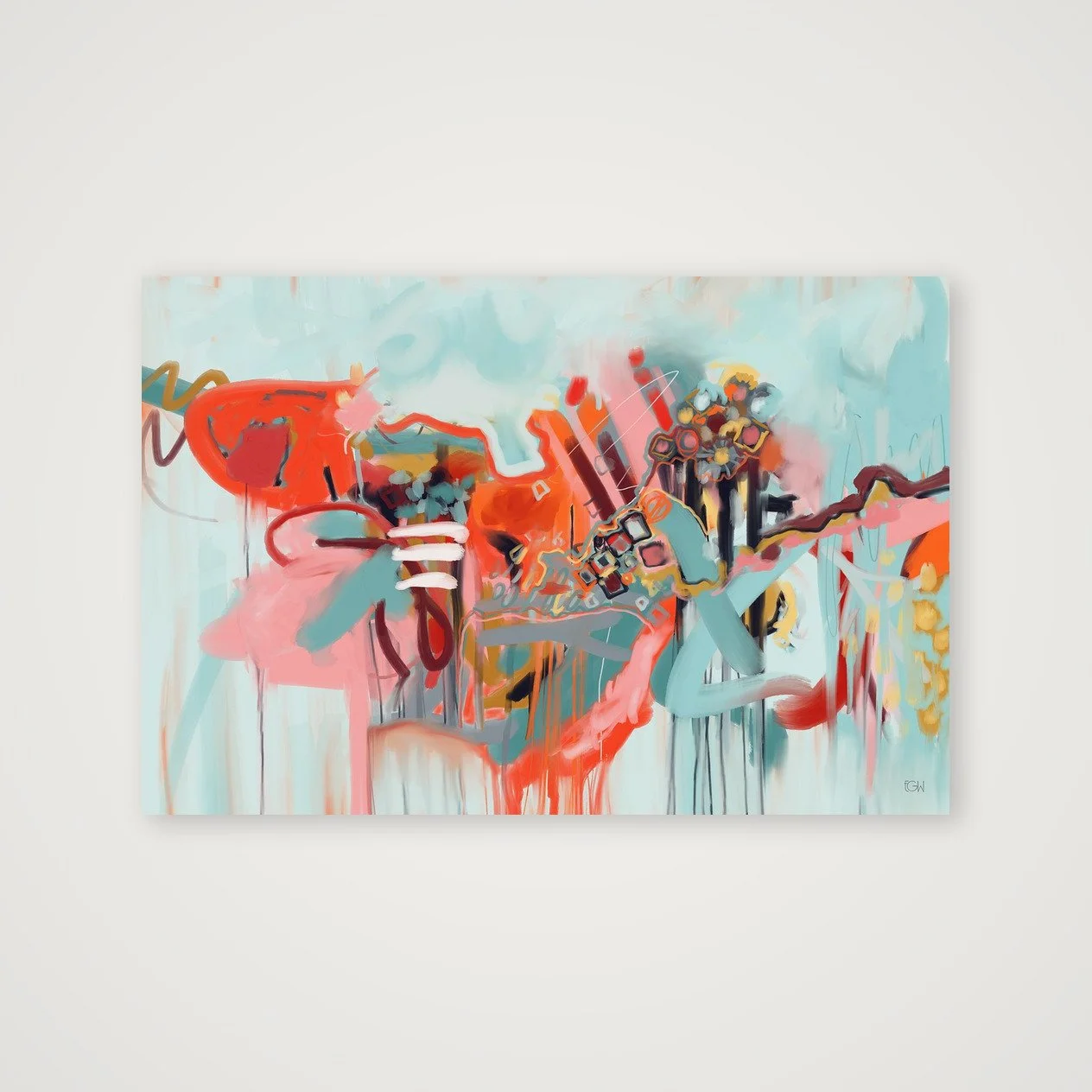
Created from original digital artwork by Emily Whitish.
Open edition
Professionally printed on museum-quality Hahnemühle Photo Rag 308 gsm using archival pigment inks
100% cotton, matte fine-art paper with a softly textured surface
Artwork is printed to the full listed dimensions with no added white border unless otherwise shown
Each print is digitally signed by the artist
Includes a Certificate of Authenticity
Optional frames are made from sustainably sourced solid wood and available in select sizes
Printed to order and shipped directly to you in protective, sustainable packaging
Each artwork is offered only in carefully selected sizes that preserve the original composition. Cropped or alternate aspect-ratio versions are not available.
Frames are available for select sizes only. Unframed prints are offered in both imperial and metric dimensions. If you plan to use custom framing, either format will work. If you’re using a ready-made frame, choose the size that best matches standard frame dimensions where you live.
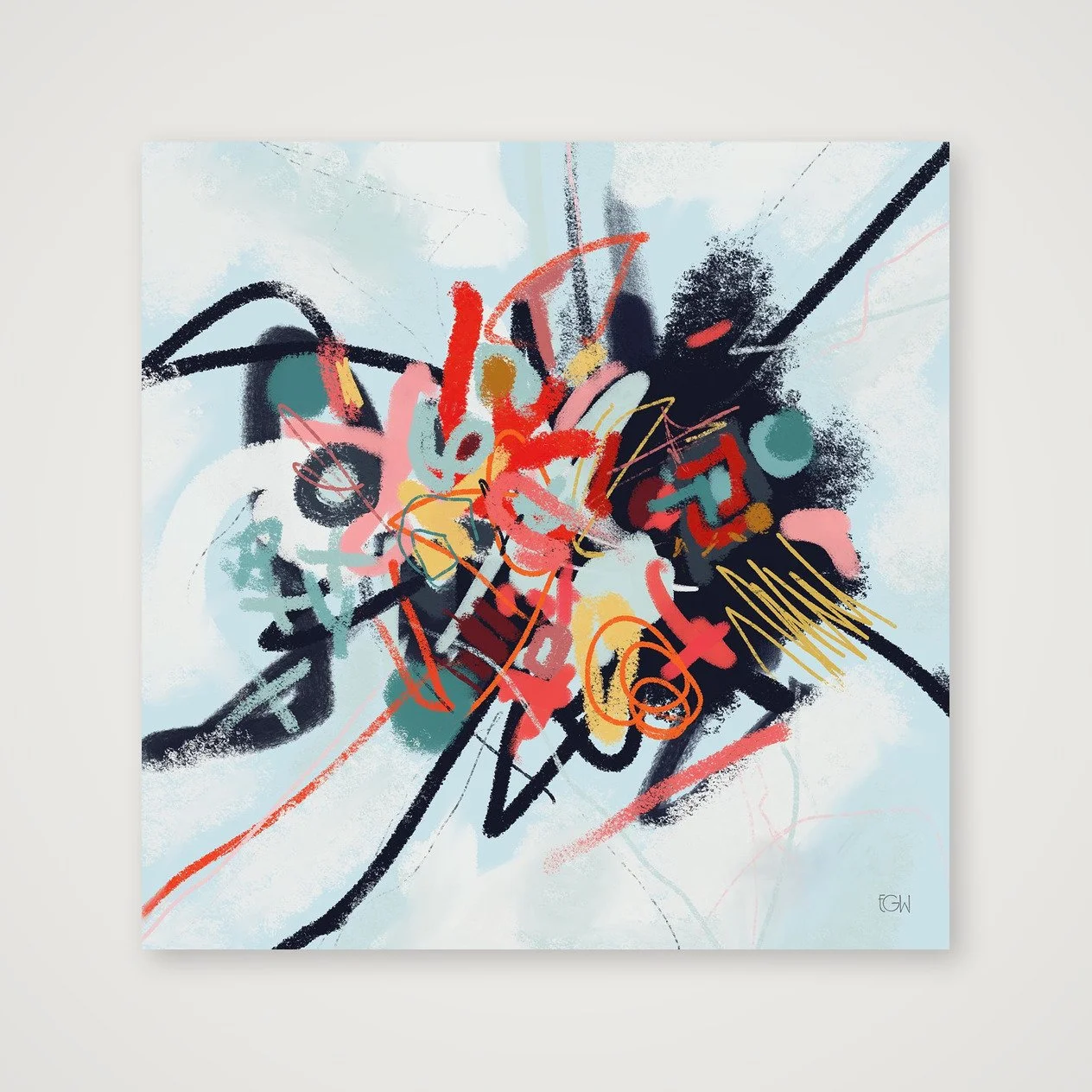
Created from original digital artwork by Emily Whitish.
Open edition
Professionally printed on museum-quality Hahnemühle Photo Rag 308 gsm using archival pigment inks
100% cotton, matte fine-art paper with a softly textured surface
Artwork is printed to the full listed dimensions with no added white border unless otherwise shown
Each print is digitally signed by the artist
Includes a Certificate of Authenticity
Optional frames are made from sustainably sourced solid wood and available in select sizes
Printed to order and shipped directly to you in protective, sustainable packaging
Each artwork is offered only in carefully selected sizes that preserve the original composition. Cropped or alternate aspect-ratio versions are not available.
Frames are available for select sizes only. Unframed prints are offered in both imperial and metric dimensions. If you plan to use custom framing, either format will work. If you’re using a ready-made frame, choose the size that best matches standard frame dimensions where you live.
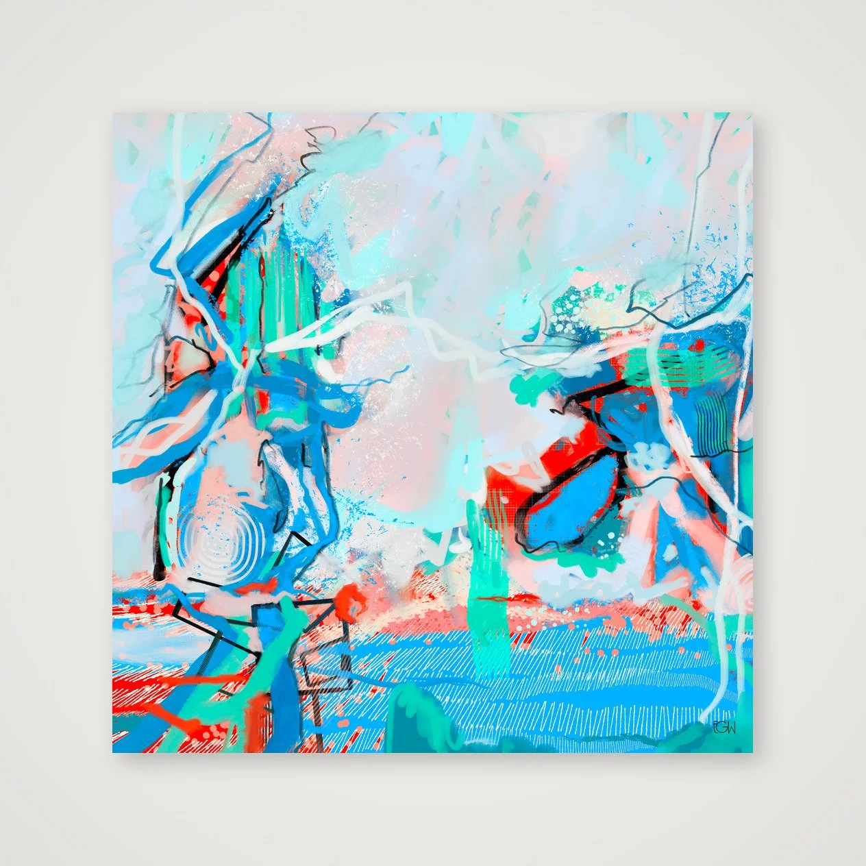
Created from original digital artwork by Emily Whitish.
Open edition
Professionally printed on museum-quality Hahnemühle Photo Rag 308 gsm using archival pigment inks
100% cotton, matte fine-art paper with a softly textured surface
Artwork is printed to the full listed dimensions with no added white border unless otherwise shown
Each print is digitally signed by the artist
Includes a Certificate of Authenticity
Optional frames are made from sustainably sourced solid wood and available in select sizes
Printed to order and shipped directly to you in protective, sustainable packaging
Each artwork is offered only in carefully selected sizes that preserve the original composition. Cropped or alternate aspect-ratio versions are not available.
Frames are available for select sizes only. Unframed prints are offered in both imperial and metric dimensions. If you plan to use custom framing, either format will work. If you’re using a ready-made frame, choose the size that best matches standard frame dimensions where you live.
Created from original digital artwork by Emily Whitish.
Open edition
Professionally printed on museum-quality Hahnemühle Photo Rag 308 gsm using archival pigment inks
100% cotton, matte fine-art paper with a softly textured surface
Artwork is printed to the full listed dimensions with no added white border unless otherwise shown
Each print is digitally signed by the artist
Includes a Certificate of Authenticity
Optional frames are made from sustainably sourced solid wood and available in select sizes
Printed to order and shipped directly to you in protective, sustainable packaging
Each artwork is offered only in carefully selected sizes that preserve the original composition. Cropped or alternate aspect-ratio versions are not available.
Frames are available for select sizes only. Unframed prints are offered in both imperial and metric dimensions. If you plan to use custom framing, either format will work. If you’re using a ready-made frame, choose the size that best matches standard frame dimensions where you live.
Created from original digital artwork by Emily Whitish.
Open edition
Professionally printed on museum-quality Hahnemühle Photo Rag 308 gsm using archival pigment inks
100% cotton, matte fine-art paper with a softly textured surface
Artwork is printed to the full listed dimensions with no added white border unless otherwise shown
Each print is digitally signed by the artist
Includes a Certificate of Authenticity
Optional frames are made from sustainably sourced solid wood and available in select sizes
Printed to order and shipped directly to you in protective, sustainable packaging
Each artwork is offered only in carefully selected sizes that preserve the original composition. Cropped or alternate aspect-ratio versions are not available.
Frames are available for select sizes only. Unframed prints are offered in both imperial and metric dimensions. If you plan to use custom framing, either format will work. If you’re using a ready-made frame, choose the size that best matches standard frame dimensions where you live.
Created from original digital artwork by Emily Whitish.
Open edition
Professionally printed on museum-quality Hahnemühle Photo Rag 308 gsm using archival pigment inks
100% cotton, matte fine-art paper with a softly textured surface
Artwork is printed to the full listed dimensions with no added white border unless otherwise shown
Each print is digitally signed by the artist
Includes a Certificate of Authenticity
Optional frames are made from sustainably sourced solid wood and available in select sizes
Printed to order and shipped directly to you in protective, sustainable packaging
Each artwork is offered only in carefully selected sizes that preserve the original composition. Cropped or alternate aspect-ratio versions are not available.
Frames are available for select sizes only. Unframed prints are offered in both imperial and metric dimensions. If you plan to use custom framing, either format will work. If you’re using a ready-made frame, choose the size that best matches standard frame dimensions where you live.
Created from original digital artwork by Emily Whitish.
Open edition
Professionally printed on museum-quality Hahnemühle Photo Rag 308 gsm using archival pigment inks
100% cotton, matte fine-art paper with a softly textured surface
Artwork is printed to the full listed dimensions with no added white border unless otherwise shown
Each print is digitally signed by the artist
Includes a Certificate of Authenticity
Optional frames are made from sustainably sourced solid wood and available in select sizes
Printed to order and shipped directly to you in protective, sustainable packaging
Each artwork is offered only in carefully selected sizes that preserve the original composition. Cropped or alternate aspect-ratio versions are not available.
Frames are available for select sizes only. Unframed prints are offered in both imperial and metric dimensions. If you plan to use custom framing, either format will work. If you’re using a ready-made frame, choose the size that best matches standard frame dimensions where you live.
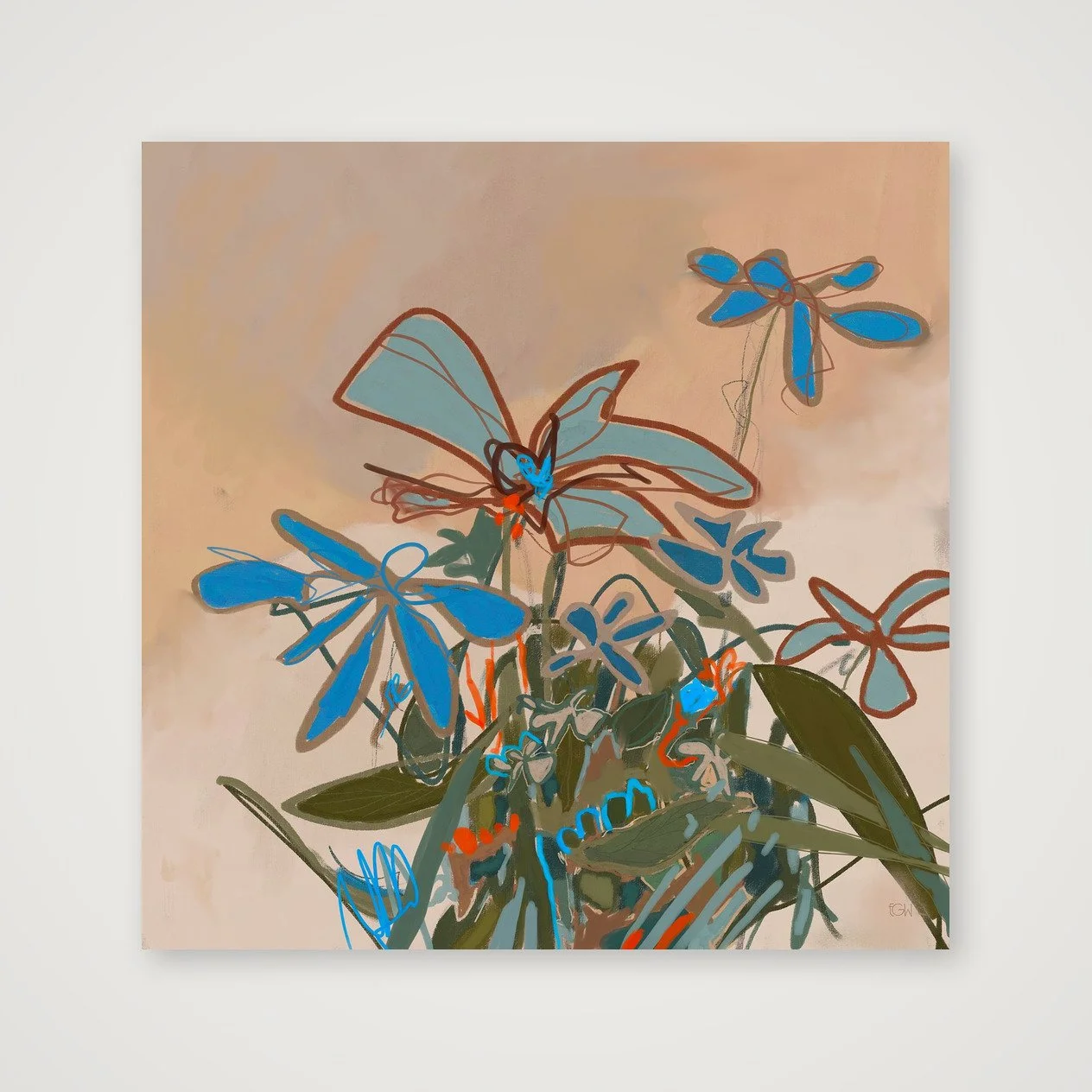
Created from original digital artwork by Emily Whitish.
Open edition
Professionally printed on museum-quality Hahnemühle Photo Rag 308 gsm using archival pigment inks
100% cotton, matte fine-art paper with a softly textured surface
Artwork is printed to the full listed dimensions with no added white border unless otherwise shown
Each print is digitally signed by the artist
Includes a Certificate of Authenticity
Optional frames are made from sustainably sourced solid wood and available in select sizes
Printed to order and shipped directly to you in protective, sustainable packaging
Each artwork is offered only in carefully selected sizes that preserve the original composition. Cropped or alternate aspect-ratio versions are not available.
Frames are available for select sizes only. Unframed prints are offered in both imperial and metric dimensions. If you plan to use custom framing, either format will work. If you’re using a ready-made frame, choose the size that best matches standard frame dimensions where you live.
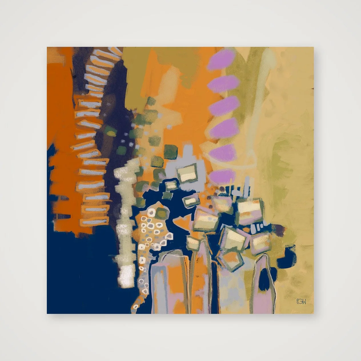
Created from original digital artwork by Emily Whitish.
Open edition
Professionally printed on museum-quality Hahnemühle Photo Rag 308 gsm using archival pigment inks
100% cotton, matte fine-art paper with a softly textured surface
Artwork is printed to the full listed dimensions with no added white border unless otherwise shown
Each print is digitally signed by the artist
Includes a Certificate of Authenticity
Optional frames are made from sustainably sourced solid wood and available in select sizes
Printed to order and shipped directly to you in protective, sustainable packaging
Each artwork is offered only in carefully selected sizes that preserve the original composition. Cropped or alternate aspect-ratio versions are not available.
Frames are available for select sizes only. Unframed prints are offered in both imperial and metric dimensions. If you plan to use custom framing, either format will work. If you’re using a ready-made frame, choose the size that best matches standard frame dimensions where you live.
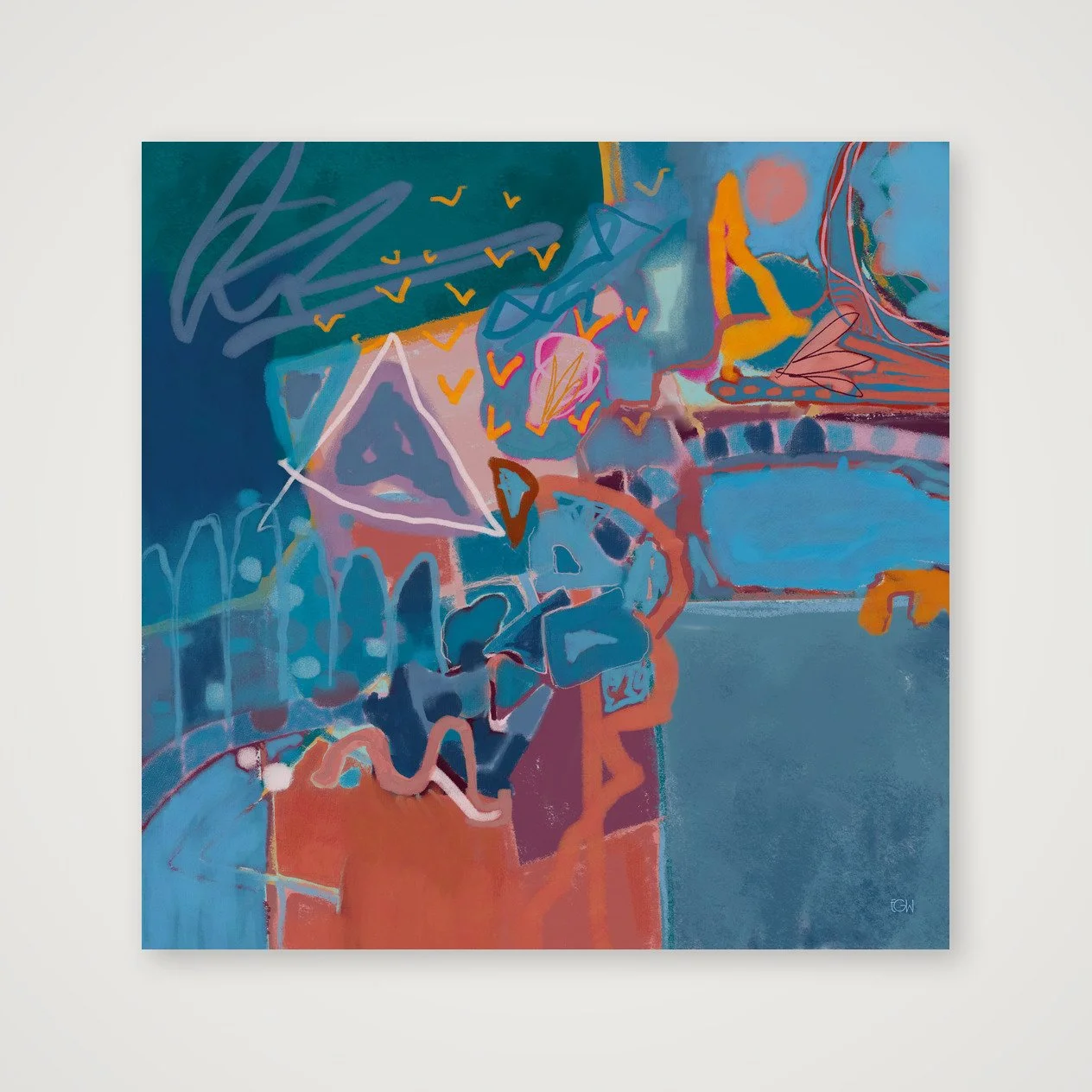
Created from original digital artwork by Emily Whitish.
Open edition
Professionally printed on museum-quality Hahnemühle Photo Rag 308 gsm using archival pigment inks
100% cotton, matte fine-art paper with a softly textured surface
Artwork is printed to the full listed dimensions with no added white border unless otherwise shown
Each print is digitally signed by the artist
Includes a Certificate of Authenticity
Optional frames are made from sustainably sourced solid wood and available in select sizes
Printed to order and shipped directly to you in protective, sustainable packaging
Each artwork is offered only in carefully selected sizes that preserve the original composition. Cropped or alternate aspect-ratio versions are not available.
Frames are available for select sizes only. Unframed prints are offered in both imperial and metric dimensions. If you plan to use custom framing, either format will work. If you’re using a ready-made frame, choose the size that best matches standard frame dimensions where you live.
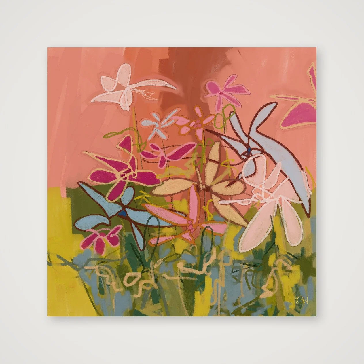
Created from original digital artwork by Emily Whitish.
Open edition
Professionally printed on museum-quality Hahnemühle Photo Rag 308 gsm using archival pigment inks
100% cotton, matte fine-art paper with a softly textured surface
Artwork is printed to the full listed dimensions with no added white border unless otherwise shown
Each print is digitally signed by the artist
Includes a Certificate of Authenticity
Optional frames are made from sustainably sourced solid wood and available in select sizes
Printed to order and shipped directly to you in protective, sustainable packaging
Each artwork is offered only in carefully selected sizes that preserve the original composition. Cropped or alternate aspect-ratio versions are not available.
Frames are available for select sizes only. Unframed prints are offered in both imperial and metric dimensions. If you plan to use custom framing, either format will work. If you’re using a ready-made frame, choose the size that best matches standard frame dimensions where you live.
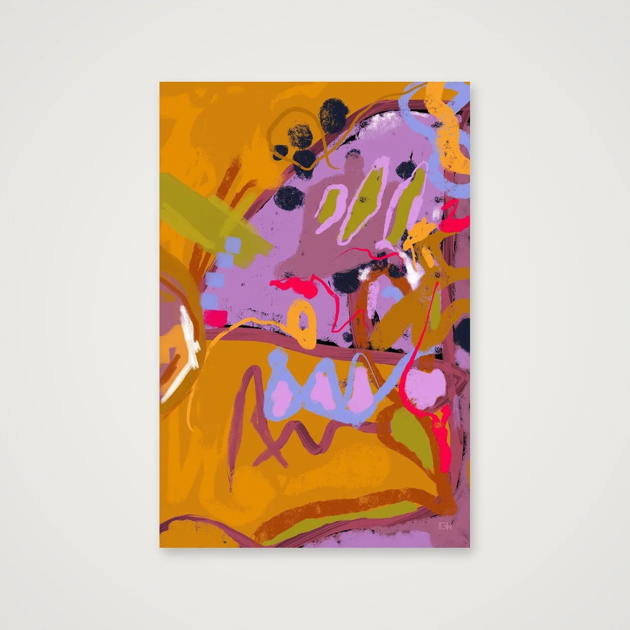
Created from original digital artwork by Emily Whitish.
Open edition
Professionally printed on museum-quality Hahnemühle Photo Rag 308 gsm using archival pigment inks
100% cotton, matte fine-art paper with a softly textured surface
Artwork is printed to the full listed dimensions with no added white border unless otherwise shown
Each print is digitally signed by the artist
Includes a Certificate of Authenticity
Optional frames are made from sustainably sourced solid wood and available in select sizes
Printed to order and shipped directly to you in protective, sustainable packaging
Each artwork is offered only in carefully selected sizes that preserve the original composition. Cropped or alternate aspect-ratio versions are not available.
Frames are available for select sizes only. Unframed prints are offered in both imperial and metric dimensions. If you plan to use custom framing, either format will work. If you’re using a ready-made frame, choose the size that best matches standard frame dimensions where you live.
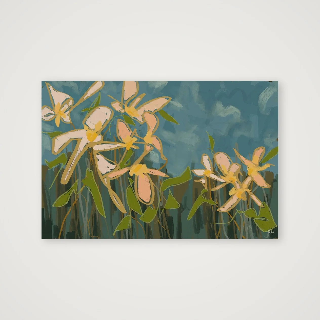
Created from original digital artwork by Emily Whitish.
Open edition
Professionally printed on museum-quality Hahnemühle Photo Rag 308 gsm using archival pigment inks
100% cotton, matte fine-art paper with a softly textured surface
Artwork is printed to the full listed dimensions with no added white border unless otherwise shown
Each print is digitally signed by the artist
Includes a Certificate of Authenticity
Optional frames are made from sustainably sourced solid wood and available in select sizes
Printed to order and shipped directly to you in protective, sustainable packaging
Each artwork is offered only in carefully selected sizes that preserve the original composition. Cropped or alternate aspect-ratio versions are not available.
Frames are available for select sizes only. Unframed prints are offered in both imperial and metric dimensions. If you plan to use custom framing, either format will work. If you’re using a ready-made frame, choose the size that best matches standard frame dimensions where you live.
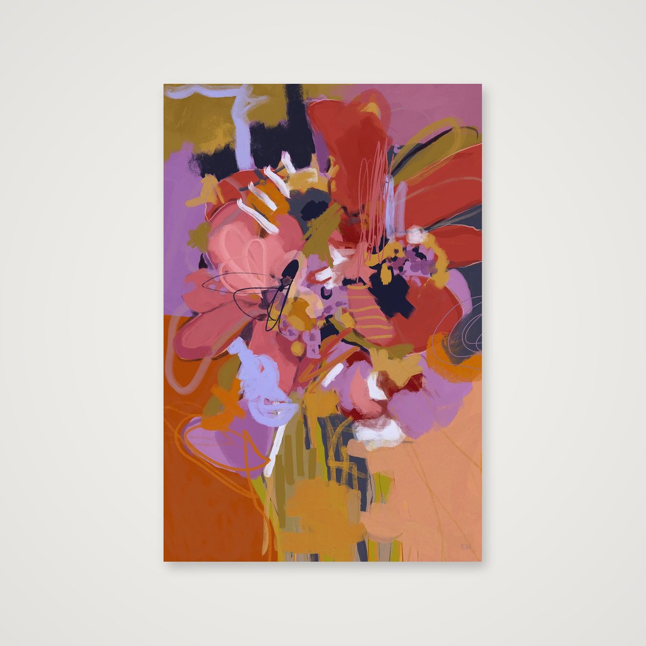
Created from original digital artwork by Emily Whitish.
Open edition
Professionally printed on museum-quality Hahnemühle Photo Rag 308 gsm using archival pigment inks
100% cotton, matte fine-art paper with a softly textured surface
Artwork is printed to the full listed dimensions with no added white border unless otherwise shown
Each print is digitally signed by the artist
Includes a Certificate of Authenticity
Optional frames are made from sustainably sourced solid wood and available in select sizes
Printed to order and shipped directly to you in protective, sustainable packaging
Each artwork is offered only in carefully selected sizes that preserve the original composition. Cropped or alternate aspect-ratio versions are not available.
Frames are available for select sizes only. Unframed prints are offered in both imperial and metric dimensions. If you plan to use custom framing, either format will work. If you’re using a ready-made frame, choose the size that best matches standard frame dimensions where you live.
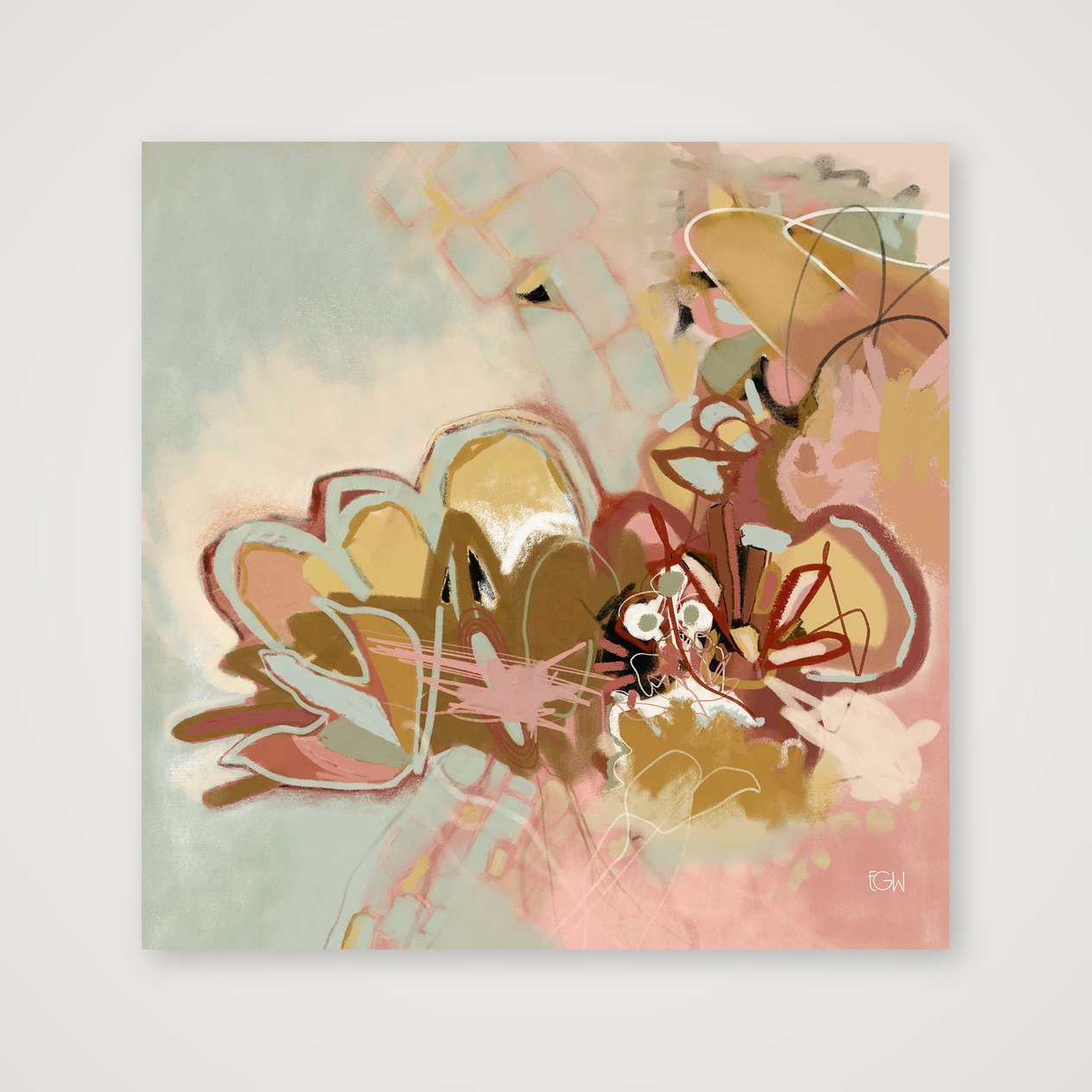
Created from original digital artwork by Emily Whitish.
Open edition
Professionally printed on museum-quality Hahnemühle Photo Rag 308 gsm using archival pigment inks
100% cotton, matte fine-art paper with a softly textured surface
Artwork is printed to the full listed dimensions with no added white border unless otherwise shown
Each print is digitally signed by the artist
Includes a Certificate of Authenticity
Optional frames are made from sustainably sourced solid wood and available in select sizes
Printed to order and shipped directly to you in protective, sustainable packaging
Each artwork is offered only in carefully selected sizes that preserve the original composition. Cropped or alternate aspect-ratio versions are not available.
Frames are available for select sizes only. Unframed prints are offered in both imperial and metric dimensions. If you plan to use custom framing, either format will work. If you’re using a ready-made frame, choose the size that best matches standard frame dimensions where you live.
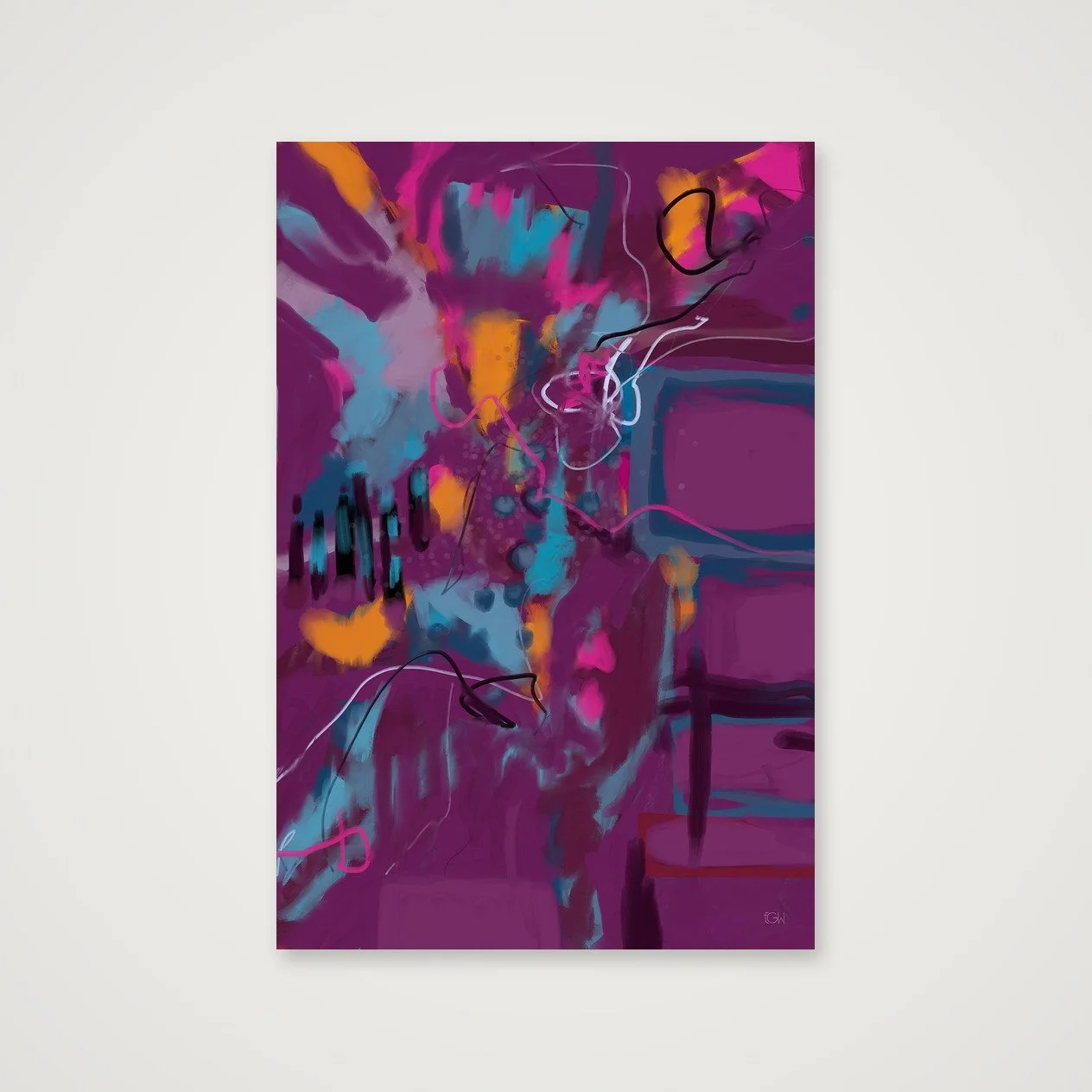
Created from original digital artwork by Emily Whitish.
Open edition
Professionally printed on museum-quality Hahnemühle Photo Rag 308 gsm using archival pigment inks
100% cotton, matte fine-art paper with a softly textured surface
Artwork is printed to the full listed dimensions with no added white border unless otherwise shown
Each print is digitally signed by the artist
Includes a Certificate of Authenticity
Optional frames are made from sustainably sourced solid wood and available in select sizes
Printed to order and shipped directly to you in protective, sustainable packaging
Each artwork is offered only in carefully selected sizes that preserve the original composition. Cropped or alternate aspect-ratio versions are not available.
Frames are available for select sizes only. Unframed prints are offered in both imperial and metric dimensions. If you plan to use custom framing, either format will work. If you’re using a ready-made frame, choose the size that best matches standard frame dimensions where you live.
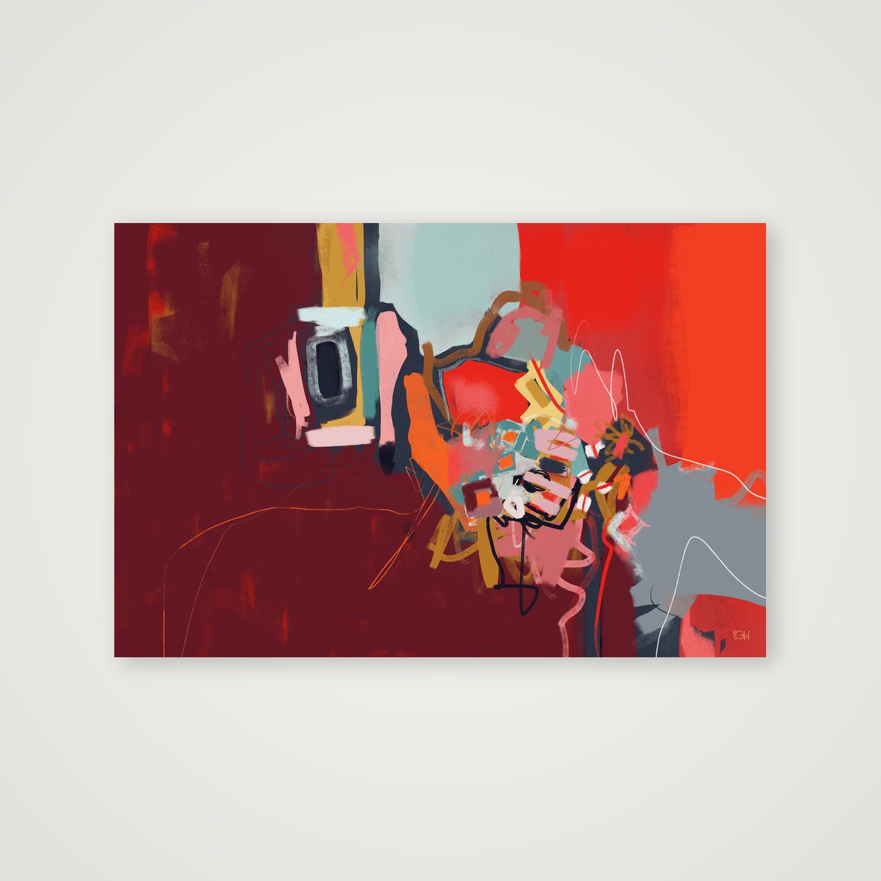
Created from original digital artwork by Emily Whitish.
Open edition
Professionally printed on museum-quality Hahnemühle Photo Rag 308 gsm using archival pigment inks
100% cotton, matte fine-art paper with a softly textured surface
Artwork is printed to the full listed dimensions with no added white border unless otherwise shown
Each print is digitally signed by the artist
Includes a Certificate of Authenticity
Optional frames are made from sustainably sourced solid wood and available in select sizes
Printed to order and shipped directly to you in protective, sustainable packaging
Each artwork is offered only in carefully selected sizes that preserve the original composition. Cropped or alternate aspect-ratio versions are not available.
Frames are available for select sizes only. Unframed prints are offered in both imperial and metric dimensions. If you plan to use custom framing, either format will work. If you’re using a ready-made frame, choose the size that best matches standard frame dimensions where you live.
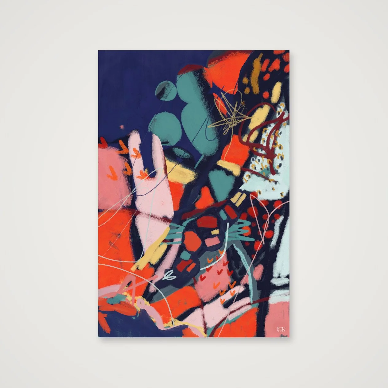
Created from original digital artwork by Emily Whitish.
Open edition
Professionally printed on museum-quality Hahnemühle Photo Rag 308 gsm using archival pigment inks
100% cotton, matte fine-art paper with a softly textured surface
Artwork is printed to the full listed dimensions with no added white border unless otherwise shown
Each print is digitally signed by the artist
Includes a Certificate of Authenticity
Optional frames are made from sustainably sourced solid wood and available in select sizes
Printed to order and shipped directly to you in protective, sustainable packaging
Each artwork is offered only in carefully selected sizes that preserve the original composition. Cropped or alternate aspect-ratio versions are not available.
Frames are available for select sizes only. Unframed prints are offered in both imperial and metric dimensions. If you plan to use custom framing, either format will work. If you’re using a ready-made frame, choose the size that best matches standard frame dimensions where you live.
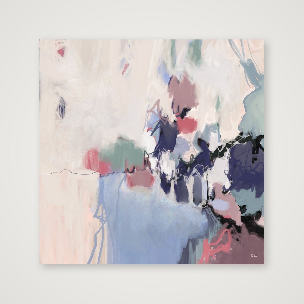
Created from original digital artwork by Emily Whitish.
Open edition
Professionally printed on museum-quality Hahnemühle Photo Rag 308 gsm using archival pigment inks
100% cotton, matte fine-art paper with a softly textured surface
Artwork is printed to the full listed dimensions with no added white border unless otherwise shown
Each print is digitally signed by the artist
Includes a Certificate of Authenticity
Optional frames are made from sustainably sourced solid wood and available in select sizes
Printed to order and shipped directly to you in protective, sustainable packaging
Each artwork is offered only in carefully selected sizes that preserve the original composition. Cropped or alternate aspect-ratio versions are not available.
Frames are available for select sizes only. Unframed prints are offered in both imperial and metric dimensions. If you plan to use custom framing, either format will work. If you’re using a ready-made frame, choose the size that best matches standard frame dimensions where you live.
Created from original digital artwork by Emily Whitish.
Open edition
Professionally printed on museum-quality Hahnemühle Photo Rag 308 gsm using archival pigment inks
100% cotton, matte fine-art paper with a softly textured surface
Artwork is printed to the full listed dimensions with no added white border unless otherwise shown
Each print is digitally signed by the artist
Includes a Certificate of Authenticity
Optional frames are made from sustainably sourced solid wood and available in select sizes
Printed to order and shipped directly to you in protective, sustainable packaging
Each artwork is offered only in carefully selected sizes that preserve the original composition. Cropped or alternate aspect-ratio versions are not available.
Frames are available for select sizes only. Unframed prints are offered in both imperial and metric dimensions. If you plan to use custom framing, either format will work. If you’re using a ready-made frame, choose the size that best matches standard frame dimensions where you live.
Created from original digital artwork by Emily Whitish.
Open edition
Professionally printed on museum-quality Hahnemühle Photo Rag 308 gsm using archival pigment inks
100% cotton, matte fine-art paper with a softly textured surface
Artwork is printed to the full listed dimensions with no added white border unless otherwise shown
Each print is digitally signed by the artist
Includes a Certificate of Authenticity
Optional frames are made from sustainably sourced solid wood and available in select sizes
Printed to order and shipped directly to you in protective, sustainable packaging
Each artwork is offered only in carefully selected sizes that preserve the original composition. Cropped or alternate aspect-ratio versions are not available.
Frames are available for select sizes only. Unframed prints are offered in both imperial and metric dimensions. If you plan to use custom framing, either format will work. If you’re using a ready-made frame, choose the size that best matches standard frame dimensions where you live.
Created from original digital artwork by Emily Whitish.
Open edition
Professionally printed on museum-quality Hahnemühle Photo Rag 308 gsm using archival pigment inks
100% cotton, matte fine-art paper with a softly textured surface
Artwork is printed to the full listed dimensions with no added white border unless otherwise shown
Each print is digitally signed by the artist
Includes a Certificate of Authenticity
Optional frames are made from sustainably sourced solid wood and available in select sizes
Printed to order and shipped directly to you in protective, sustainable packaging
Each artwork is offered only in carefully selected sizes that preserve the original composition. Cropped or alternate aspect-ratio versions are not available.
Frames are available for select sizes only. Unframed prints are offered in both imperial and metric dimensions. If you plan to use custom framing, either format will work. If you’re using a ready-made frame, choose the size that best matches standard frame dimensions where you live.

Emily Whitish is a contemporary abstract artist based on Bainbridge Island, Washington. Her work is driven by color, movement, intuition, and a strong interest in composition and visual tension. She creates expressive paintings that balance structure with spontaneity and invite close attention to shape, gesture, and unexpected relationships.
 High Five Design Co.
 by Emily Whitish is a design and digital marketing company in Seattle, WA. I specialize in Website Templates and custom One-Day Websites for therapists, counselors, and coaches.
Created from original digital artwork by Emily Whitish.
Open edition
Professionally printed on museum-quality Hahnemühle Photo Rag 308 gsm using archival pigment inks
100% cotton, matte fine-art paper with a softly textured surface
Artwork is printed to the full listed dimensions with no added white border unless otherwise shown
Each print is digitally signed by the artist
Includes a Certificate of Authenticity
Optional frames are made from sustainably sourced solid wood and available in select sizes
Printed to order and shipped directly to you in protective, sustainable packaging
Each artwork is offered only in carefully selected sizes that preserve the original composition. Cropped or alternate aspect-ratio versions are not available.
Frames are available for select sizes only. Unframed prints are offered in both imperial and metric dimensions. If you plan to use custom framing, either format will work. If you’re using a ready-made frame, choose the size that best matches standard frame dimensions where you live.